So without getting political about it, the attached may soon be of real value. Not crypto-currency; let’s call it comi-currency.
If the attempted use of this gets you in a jam, please don’t come crying to me.

Smile! You’re at the best WordPress.com site ever
March 16, 2023
Art, Comic Books, Strange and Pointless Leave a comment
So without getting political about it, the attached may soon be of real value. Not crypto-currency; let’s call it comi-currency.
If the attempted use of this gets you in a jam, please don’t come crying to me.
November 8, 2014
Art, Comic Books, Old Photos, Strange and Pointless Billy the Kid, kid comic books Leave a comment

William H. Bonney (born William Henry McCarty, Jr. c.1859-1861 – July 14, 1881), also known as William Antrim and Kid Antrim, was a 19th-century gunman who participated in the Lincoln County War in New Mexico and became a frontier outlaw in the American West. According to legend, he killed twenty-one men, but it is generally believed he only killed eight. He killed his first man on August 17, 1877, at around 17 years of age.
At the time Bonney was killed by Sheriff Pat Garrett at Pete Maxwell’s place at Fort Sumner, New Mexico, the nickname of “Billy, The Kid” (note the comma and capitalization used back then) had just started being applied to him. He was usually just called The Kid. The usage of calling a young person a “kid” was known for hundreds of years prior to Bonney, but it seems to have only become common around the 1840s.
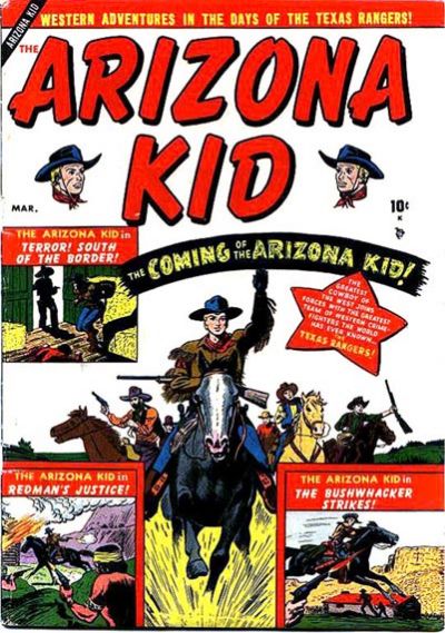
In the world of comic books, there have been a great many Kids. In a quick search, I found a few for you:
Colorado Kid
Cheyenne Kid
Arizona Kid
Durango Kid
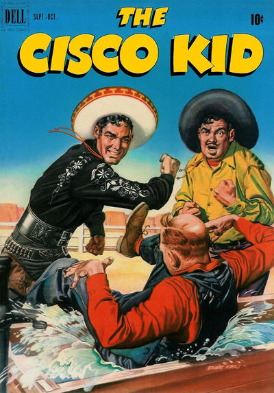
Cisco Kid
Apache Kid
Sundance Kid
Reno Kid
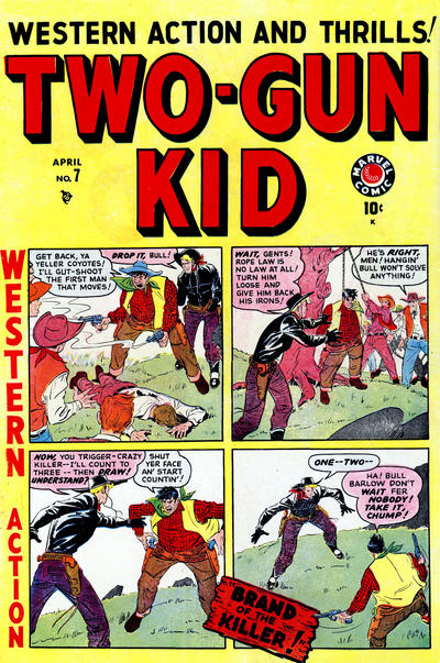
Two-Gun Kid
Kid Slade
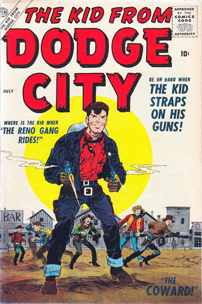
Kid from Dodge City
Frisco Kid
Kid Cowboy
Presto Kid
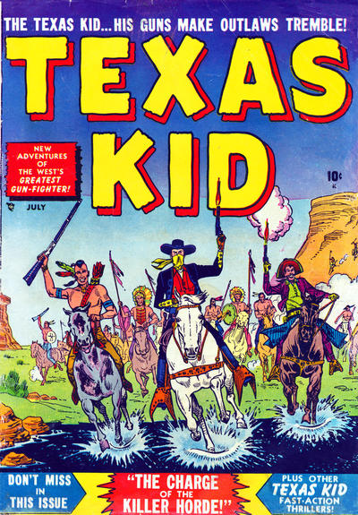
Texas Kid
Ringo Kid
Oklahoma Kid
Cotton Kid
Hollywood Kid
Star Kid
Outlaw Kid
Kid Montana
Western Kid
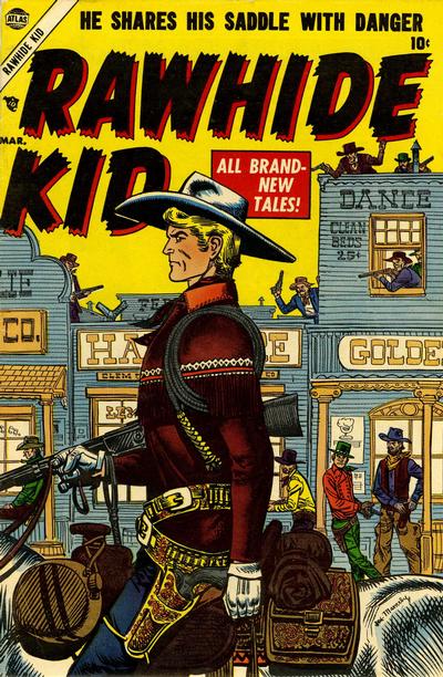
Rawhide Kid
Fargo Kid
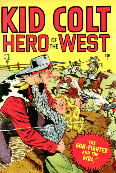
Kid Colt
Billy the Kid
Stardust Kid
Lemonade Kid
Dynamite Kid
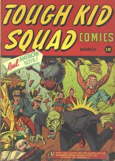
Many of these were published by Timely/Atlas/Marvel, and they also put out a comic book called Tough Kid Squad during WWII:
In Italy, a comic book publisher printed a version of the Superman character, using old American comic book art (at least in the couple of examples I have) and called him the Nembo Kid:
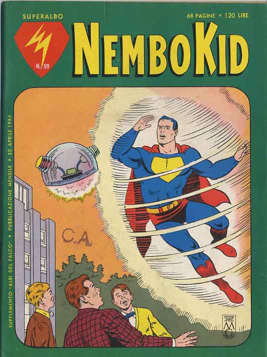
Nembo Kid translates, I believe, to “Cloud Man,” and that’s a little odd sounding to me. Maybe it plays better in Italian. Because Superman’s “S” shield wouldn’t work for a guy who’s name started with an N, the Italian publisher just blanked it out and colored the empty pentagon shape yellow or sometimes red. I really liked how that Italian comic publisher colored Batman. Since they were playing with Batman’s colors, they could easily have fixed what I considered Robin’s biggest defect: his naked legs. Just color his legs green, yellow, or red, for God’s sake. But, nooooo:

There was also a Quality Comics character named Kid Eternity. He had a particularly lame costume and his power was that a fat angel could help him summon real and fictional folks from the past to help in his adventures. I don’t much care for Kid Eternity, though his stories usually had some great art, which was true of all the Quality Comics line. After an impressive Golden Age run with great characters like the Blackhawks, Plastic Man, the Spirit, and tons of others, their publisher, Busy Arnold, packed it up in the early 1950s. He sold his characters to DC Comics and retired to Naples, Florida. Had I known, of course, that he was living in Naples I would have looked him up!!!

Other “Kid” characters, like Kid Flash, came and went, but the Western comic books with their army of Kids are what we’re here for today. Enjoy these great covers!
Great posture was as important as skill with a six-gun for this kid:
Of all the Atlas/Marvel Western kids, none had a better costume than the Ringo Kid:

Painted comic book covers weren’t common in old comics, and I never liked them. They just seemed jarring to me when used for a throwaway art form:

Billy the Kid made it into comic books a couple of times. In Fawcett Comic’s version, he was a goat:

Later, as published by the abysmally written, printed, and, said some, Mafia-connected Charlton Comics, he was a human, though out of register on the interior pages. I despised Charlton Comics; even if the art was good, the crap stories and bottom-of-the-barrel printing offended me:

Here are some other kids from the West.

 EXCITING UPDATE!
Can’t believe it’s been a year since I posted to my blog. I blame myself. Anyway, if you keep up with the news, you’ll have heard that a third, previously unknown photo of Billy the Kid has come to light. It shows him, of all things, playing croquet in 1878 with his pals at their hideout in New Mexico. It’s estimated to bring $5 million at auction, but you can see it here for free!

Billy is shown on the right in this closeup of the 4″x5″ tintype. Since it’s a tintype, the left-to-right is flopped, as in the original of the photo at the top of this blog entry. I corrected the left-to-right then, but am too lazy this evening.

But wait; there’s more! Here’s a Billy the Kid comic book cover from a series published by Toby Comics in the early 1950s:

And, finally, a Durango Kid cover from the long-running series published by Magazine Enterprises:

September 2, 2013
Comic Books, Strange and Pointless Beanie cap, Busy Arnold, Chrles Atlas, French Indo-China, G.i. Combat, Vietnam Leave a comment

Never having been a big fan of war comics, I almost didn’t download this comic book, G.I. Combat #16, from August of 1954. The cover art by Dick Dillan and Chuck Cuidera caught my eye, as they were the team who drew and inked my favorite Blackhawk comic books, which are on the periphery, I suppose, of war comics. The other almost-war comic I love is Don Winslow of the Navy, which was originally published by Fawcett.
This G.I. Combat issue features the first Vietnam-based war story I’ve seen: “Airfield in Hell.” Of course, at that time, Vietnam was known as French Indo-China. Here’s the splash page for that story:

Following the story is this zany ad for a 98¢ electric Brainstorm Beanie; I bet the freckled hipster shown wearing it would be even more smug if it were a solar- instead of battery-powered Brainstorm Beanie:

And, at the end of the issue is a poignant ad for the Charles Atlas bodybuilding course.

An unfortunate fellow, Joe, is humiliated in front of his girlfriend. In a moment of fury, he sends off for the Charles Atlas course and later becomes a buff and powerful force to be reckoned with. How much later is the question that doesn’t get answered in this ad, though the copy says it will happen “almost before you realize it.” That’s a very carefully worded sentence.
It can’t happen too quickly to suit Joe, I’m sure, but revenge is a dish best eaten cold. Since Joe, his girlfriend, and the white-haired lout who gets his comeuppance are all wearing the same outfits in this sequence, I’m guessing it occurred in one summer.
I have a skinny cousin who took that course and I didn’t expect it to do much for him. I saw him many years later and was stunned at what a brawny fellow he had turned into; he looked like Superman. But that was years, not months, and he also had served 20 years in the Marines.
Two years after this comic was published by Quality Comics, their stable of features was sold to DC Comics and Quality bit the dust. Blackhawk and G.I. Combat were two comics (a love comic was a third) that DC chose to continue publishing. The publisher of Quality, Busy Arnold, retired to Naples and I wish I had known that before he died; I would have looked him up!
August 18, 2013
Comic Books, Strange and Pointless 4 Comments
In our last post, we showed a comic-book rack from 1945, with a young man reading one of the offerings on display. The photo we used was a portion of a larger photo from the Life magazine archives. Here’s the whole photo:
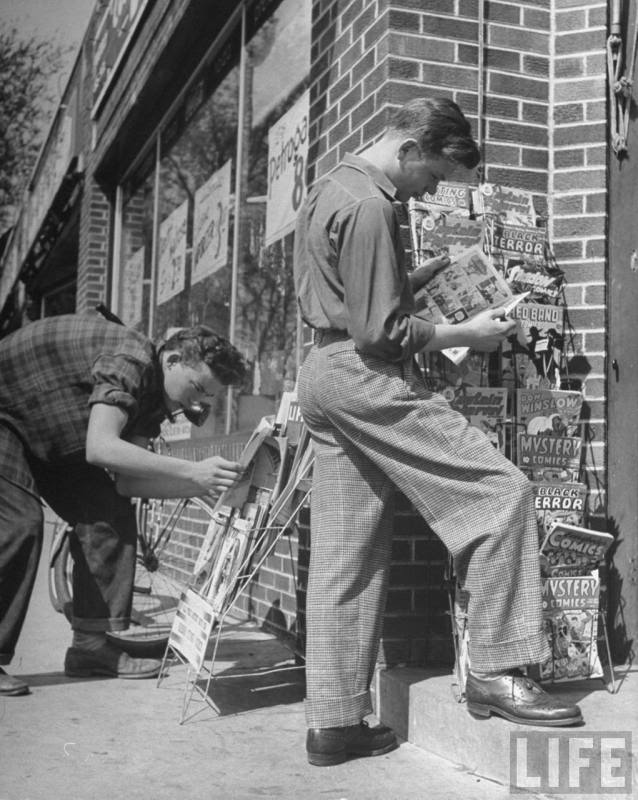
Having little going this weekend, I decided to do some research and find the exact covers for all the comics shown on that rack. We’ll start at the top, and go from left to right.
Here’s the first comic, Exciting Comics #38 from April of 1945. Note the sensational cover art by Alex Schomburg. Schomburg was a Puerto Rican-born artist who came to the U.S. in the 1920s and began his ten-year comic-book career in the early 1940s. He worked for Nedor/Better/Standard Publications (as in this instance), and also for Timely Comics, which later evolved into the Marvel Comics Group. Schomburg had two distinct styles; the regular pen-and-ink style, shown here, and a later airbrushed style. For the pen-and-ink covers, he signed his name as Schomburg and for the airbrushed covers, he signed his name as Xela (Alex backwards).
The cover-featured heroes were the Black Terror and his kid sidekick Tim; together, they were referred to as the Terror Twins. Their uniforms or costumes were perhaps the most stylish of those worn by anyone in the Golden Age of Comics. We’ll see them again in this blog entry.

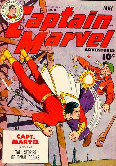
Next on the rack is Captain Marvel Adventures #46, from May of 1945. Probably the best selling comic book of the 1940s, selling over a million copies an issue; CMA was published by Fawcett. Outselling Superman was quite an achievement, and for a while, Captain Marvel Adventures was published every other week instead of monthly, as most comics were.
The head artist for Captain Marvel was C. C. Beck, who later retired to Florida. I was lucky enough to correspond with him by letter in his retirement days and he was an entertainingly cranky and acerbic correspondent! His clean-line art style was perfect for comic books but deceptively simple; his rule, as he wrote to me, was never put in a line that didn’t further the story.
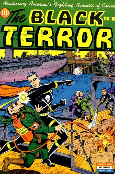
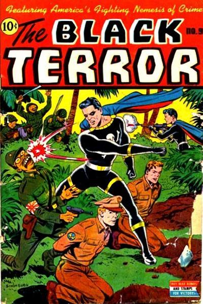
Next on our rack, after a second facing of Captain Marvel Adventures, is Black Terror #10, from May of 1945. The Second World War had ended its European theater by that time, but since comics were written, drawn and printed months in advance, it took a while for them to catch up. In his fight against Nazi villains on this cover, the Black Terror faces a neatly labelled flame thrower; Schomburg was careful to label everything of importance on his covers. He’d have so much going on in his covers that a kid would study them for quite some time after plunking down his dime for the book.
As the comic-book publishers had many stories about WWII in inventory, they’d publish them after with war with Now It Can Be Told! added to the splash pages.
The Black Terror, who in real life was a pharmacist, was invulnerable to knives, flame throwers and bullets, but in almost every story he’d be knocked out by a blow to the back of his head. It confused me as a kid and still does. Maybe it was an Achilles’ heel kind of thing but they should have explained it better in the stories.
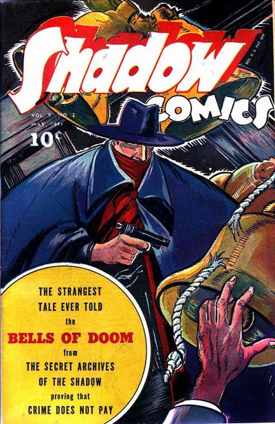
Proceeding down the comic book rack, we come to Shadow Comics volume 5, issue 2. Street & Smith published the Shadow, who was later licensed and published by Archie Comics, DC Comics and others after S&S gave up on comics, which was always a sideline to their pulp magazine business. In these original comics, the Shadow was colored a pale blue when he became invisible by clouding the minds of his enemies. Street & Smith comics had a different look than most other comics, with unusual coloring and some painted covers. I suspect that I wasn’t the only kid annoyed by the way they numbered their product with a volume/issue numbering system; it was less straightforward than just the issue numbering. For teenaged boys, who bought most of the comics, having all the issues was a big deal and probably boosted comic book sales. Hillman Publications, who published the wonderful Airboy Comics, also used that volume/issue scheme.
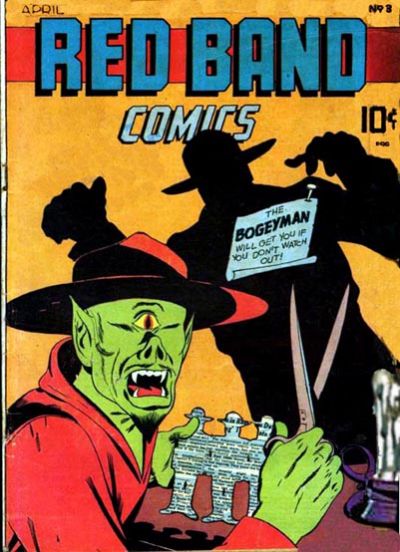
I can’t see enough of the cover of the next comic to identify it, but the one to its right is Red Band Comics, either number 3 or maybe number 4; both had the same cover art and interior contents! I show you the cover of #3 here.
This obscure and rather disturbing and unsatisfying comic was published by an outfit who only operated during 1944 and 1945 called Rural Home Publications. If DC Comics, Fawcett and Dell were first-string publishers, and Nedor/Better/Standard and Timely were second-string, then Street & Smith were third-string and Rural Home was barely in the running.
As you can see, the villain on this cover is quite horrific; the Bogeyman mentioned in the blurb was actually the hero, who’s shadow you see. Bogeyman was a swipe of Will Eisner’s Spirit charactor only drawn with a mustache. Neither Bogeyman or this ugly villain, who’s named Satanas, are in the comic book; covers were to sell the comic and often they promised more than they delivered.
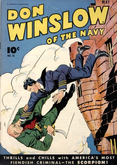
Captain Marvel Adventures #46 gets still another facing on the rack, but to its right is one of my personal favorites: Don Winslow of the Navy! This is issue #26. Don Winslow comics were well drawn and written and after Fawcett got out of the comics business in the early 1950s, they passed the rights to Winslow and a couple of other titles to Charlton Comics, who printed stories that Fawcett had in inventory for a couple of issues.
When I was a kid trying to break into comics in the late 1960s, I’d look for old issues of Don Winslow in second-hand magazine shops in New York City and try to copy the style of the guys who drew them. Great stuff!
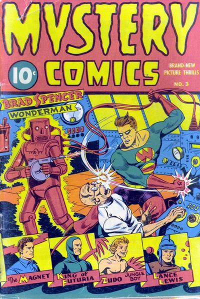
Another obscured issue and then we see Mystery Comics #3, published in 1944 (no month indicated). This great Schomburg cover features Wonder Man battling a mad scientist who’s built a human-sized pink robot who fires a Thompson sub-machine gun and glows, perhaps indicating that he’s radioactive or ultra-electrical or something. Covers sold the comics and what kid could resist a cover like that?!?!?!? This comic gets another facing at the bottom of the rack.
Below this comic on the rack is another issue of Black Terror; this one is #9, from February of 1945. These war-time comics had covers that can make us cringe today; the enemy folks in this Pacific-theater-of-war cover are absurdly rendered to convey their evil qualities, and young Tim doesn’t hesitate to mow them down with another Thompson sub-machine gun, perhaps borrowed from the pink robot in the previous comic. Those Tommy-guns were all over comic book covers in those days.
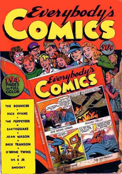
Our last issue is a whopper; the 194-page Everybody’s Comics from 1944. This giant-sized offering was published by Fox Comics, perhaps the sleaziest of all comic-book publishers (and that’s saying a great deal). What publisher Victor Fox would do was take the comic books returned by news dealers as unsold, bundle three or four random issues together and slap a new cover over whatever the contents were. There are examples of numbered issues of these giant comics that have totally different interiors; it was all very slapdash and shoddy.
That’s all for this entry. As I mentioned in the previous entry, there are no DC Comics (or Dells, or Timelys, or MLJ/Archies) on this rack, which leads me to suspect there were other comic-book racks at this store not shown in the photo.
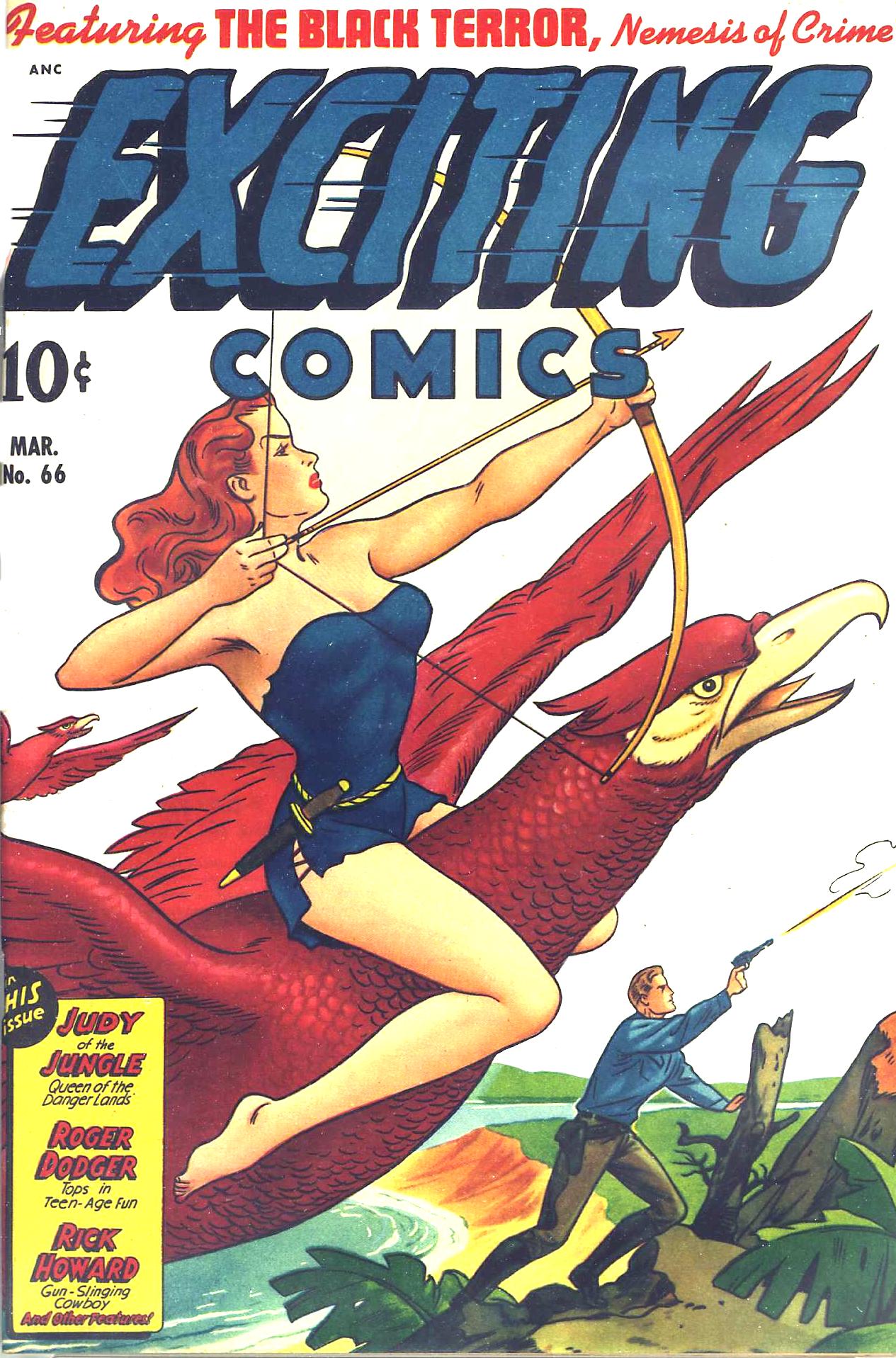
UPDATE: I can’t resist showing you one of Alex Schomburg’s airbrush-style covers; this one is from Exciting Comics #66. Much different than the ornately detailed covers he did using his pen-and-ink style, wouldn’t you say?
August 11, 2013
Art, Comic Books 75 Years of DC Comics, DC Comics, Paul Levitz 2 Comments
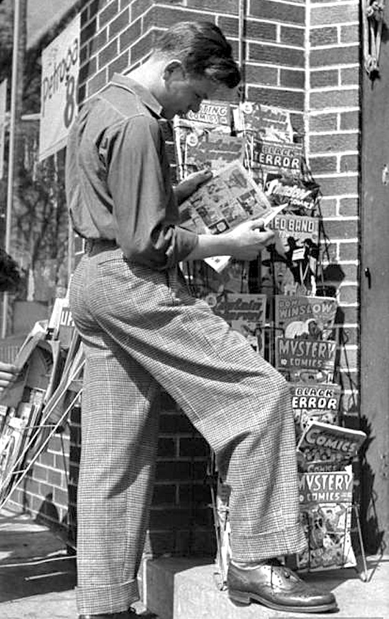
A precursor of The Office’s Jim Halpert looks at comics on sale. Oddly enough, not one DC comic on this rack. Based on the cover of Don Winslow of the Navy #26 and Red Band Comics #4 or 5 (both used the same art!), this was taken in March of 1945.
As a kid, I would read any comic book I could get my hands on, but my favorites were DC Comics. The writing, characters and production values were, to me, the best of anything out there. I liked other brands, like Harvey, Archies and Dell, but DC was tops.
Marvel Comics, at that time, was not making superhero comics; their offerings were mainly books about monsters or takeoffs on comics produced by other companies. If Harvey Comics put out Casper, the Friendly Ghost, Marvel would put out Homer, the Happy Ghost, and Charlton Comics, the bottom of the barrel in production values, put out Timmy, the Timid Ghost. One day, I’ll do a blog entry on the laughable print quality of Charlton Comics; they were usually printed so far out of register that they looked like the old red-blue 3-D comics.
So it was mainly DC for me!
My primary fascination was the drawing, but I was also intrigued by the production aspects of the things:
• How did they get from typewriter and pencil to the finished book?
• How did they print the 64 colors used?
• How come some comics used line screens for colors and some used dot screens?
• How did they get the logos and such so perfect on each issue?
• Who owned the company (DC at that time was called National Periodical Publications, Inc)?
• How did all the drugstores and newsstands get these books on the racks every other Tuesday morning?
• How much did the ads in the books cost and did they bring in dimes from the readers?
• How many copies of each comic did they print?
• How come some comics were monthlies and some were bi-monthlies?
• Why was the cost a dime?
What kind of company makes comic books?!?!??

When I was a kid, drugs stores were the best place to buy comics, as they seemed to carry all the issues published. Based on the cover of Action Comics #243 in this photo, it was taken in May of 1958. Yes; I am a geek! Had this photo been taken in Pascagoula, Mississippi, that could have been me in the pale jacket reading Strange Tales #65.
That was the stuff I wondered about.
I needed the following book: 75 Years Of DC Comics: The Art Of Modern Mythmaking, written by Paul Levitz, former president and publisher of DC Comics.

Nice touch: The title lettering mimics the lettering used on DC’s Action and Adventure comic book titles.
720 pages in a large, 15-1/2″ x 11-1/2″ format, weighing in at about 15 pounds, this is a stunner of a book. Absolutely engrossing, written in an amusing yet authoritative style, it’s simply the best history of comic books out there, and I’ve read ’em all. It’s expensive at over $150, but if that’s what it costs, so be it. It’s well worth more than that.
The book, heavily illustrated with comic covers and interior pages as you might expect, is augmented by rare photos of DC folks, from founders Malcolm Wheeler-Nicholson, Harry Donenfeld and Jack Liebowitz to production folks like Sol Harrison, Jack Adler, and, of course, many of the art and writing talents from DC’s history. Associated media, like cartoons, TV shows and films are well covered, too.
For me, whose interest in primarily in the marketing and print-production aspects of the comic books, a fascinating discovery was the cover/sales chart sheets kept by Irwin Donenfeld, Irwin was the son of DC co-founder Harry Donenfeld, and was co-owner, editorial director and vice-president of DC from about 1948 to 1968. These hand-drawn charts showed the covers of each DC comic by month, with notations of the size of the print run and percentage of copies sold written under each cover.

Notice the Batman logo change on this series of covers from the mid-1960s; one of Irwin Donenfeld’s sales charts.
Brilliant.
75 Years of DC Comics: Buy it, borrow it or check it out from a library; it is an amazing piece of work! You will learn something new on every page and the visual appeal is breathtaking. Here’s the Barnes & Noble info:
August 4, 2013
Comic Books foreign language comics 2 Comments
Not being able to read any language but English, I don’t really collect foreign (to me)-language comics. But I enjoy looking at the vintage ones. These differ from what we’re used to in the United States; the covers are usually color, but the interiors are often black-and-white, and the page counts and formats are all over the place.
Sometimes the art is crude, but more often than not you find splendidly drawn issues. Even more so than in this country, foreign comic books seem to be printed on the cheap, but some of the art– especially in the comics from Spain– is miles above what we saw in this country during the same era. Someone could probably make a mint by translating and reprinting some of these comics, which are legally in the public domain. Who could resist the adventures of Jim Turbine (Italian, I believe) or Mendoza Colt (Spain)?
Check out these great covers:
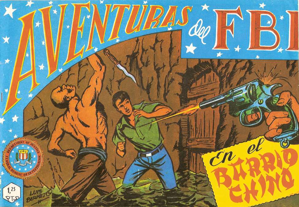
Somewhat surprising to see a book from Spain about the adventures of the U.S. FBI, but it looks exciting!

Somehow this looks like a package design rather than a comic book cover; perhaps a package for those little nasal-hair trimmers.
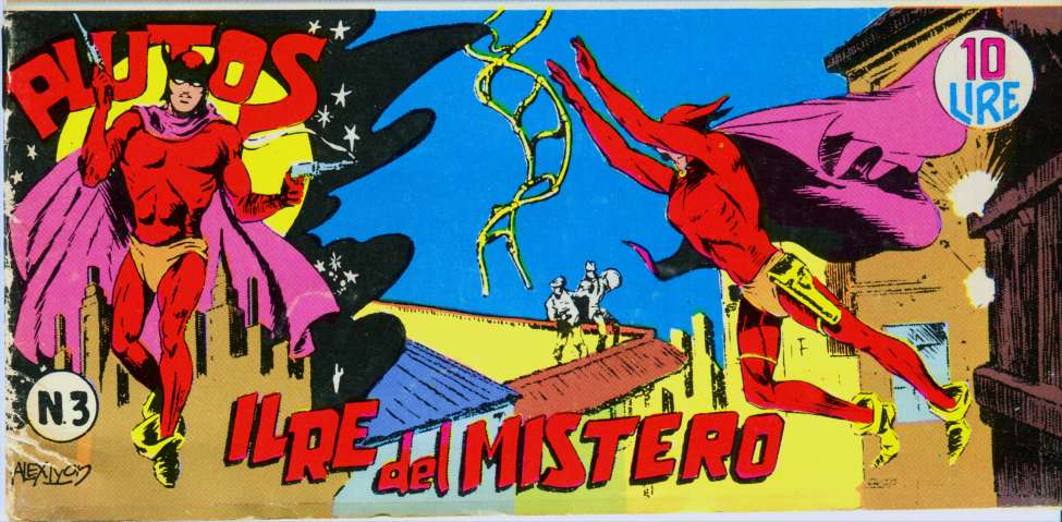
Plutos may look a bit fey here, but in the B&W interiors, he’s like a kickass Batman with pistols and a mustache!
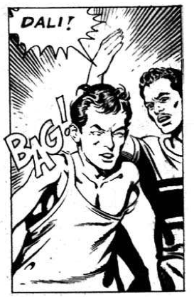
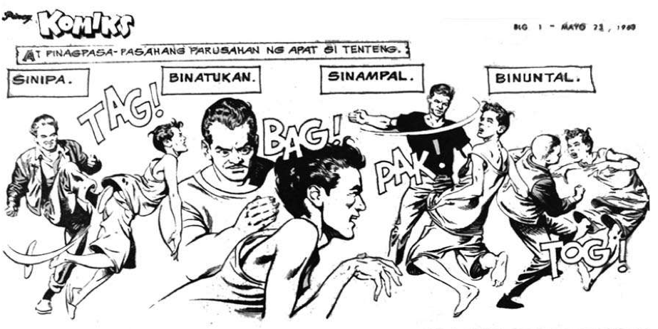
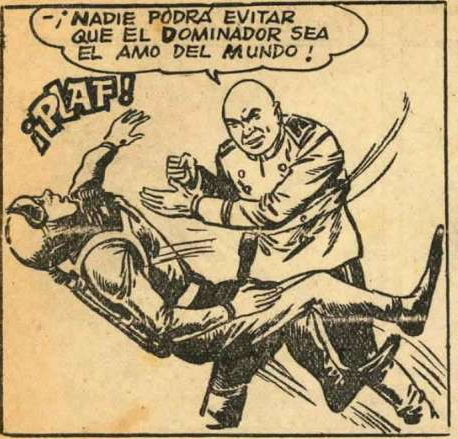
One thing I enjoy about these comics are the written sound effects, which can come as a total surprise! On the whole, foreign-language comics tend to have fewer of these sound effects than North American comics do, but when they do, they are great fun. Here are some wonderful examples:
Nicely lettered sound effect, but sounds odd to an English-speaker!
Here’s BAG again, and some others!

I tried to pronounce this one but gave up.

Nothing wrong with this one!
The more I mentally pronounce this effect, the more I like it.

Here’s another sound effect that works for me.

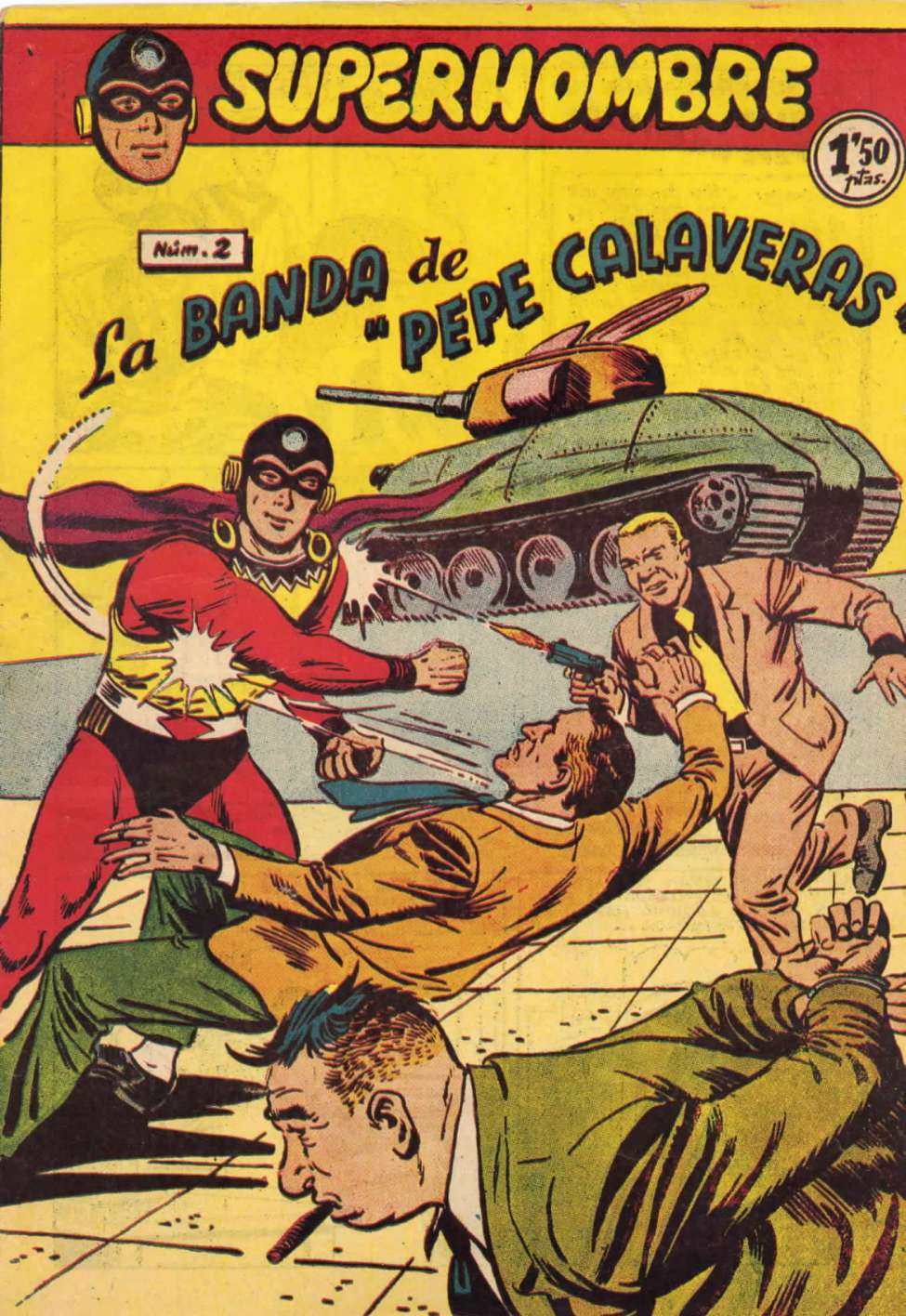
Here’s a riot of sound effects from Superhombre!

My personal favorite; it’s as good as it gets as a sound effect.

This would have been better if the object thrown was an ugly plastic shoe . . .

This effect reminds me of the nickname of the old Plastic Man character.

Don’t quite get this one.

Far better than BOOM, to my way of thinking.

Okay; they could have done better on this one.
Remember earlier when I wrote that the quality of the art in some of these books was brilliant? Check out this interior page from Mundo Futuro 026, a comic book published in Spain in the 1950s. Of course, it begs for a sound effect; an atomic explosion without a BUUUUM?!?!?!?
 Click on this page to enlarge the art; it’s really remarkable.
If you’d like to investigate these comics for free, just visit www.http://comicbookplus.com. They have scads of them!
June 22, 2013
Comic Books, Family Fun, Strange and Pointless, Weird George Reeves, Superman logo, Superman symbol, Western Costume Company 11 Comments
Of all the innumerable variations of the Superman “S” logo or symbol used on the screen and in the comics, my favorite, as you might guess from the blog entry below, is the one used on George Reeves’ costume on the Adventures of Superman TV show in the early-to-mid 1950s. I say “one,” but obsessive fans have documented how many variants were used in the six-year filming of that show; I seem to remember reading somewhere that there were 17 different ones used on the show. All had a strange but cool horizontally-stretched quality, like a CinemaScope movie.

The figure/ground aspects of that logo lend themselves to neat variations and sometimes confusion; the comic-book artist John Byrne, who grew up in England and never saw the comic books, remembers that it wasn’t until he was an adult that he realized the logo represented an “S”— he saw it on the TV show and thought it represented two fish swimming past one another! Byrne was later the first to reboot the Superman comic book series.
Of course, the main difference in the TV-show symbols was that, in the first two years when the show was filmed in black-and-white, they used brick-red- and beige-colored materials for the symbol and sewed it onto a light-gray shirt, so it looked right on a B&W TV. In the last four seasons, filmed in color, they used red and yellow on a blue shirt, as in the comic books.
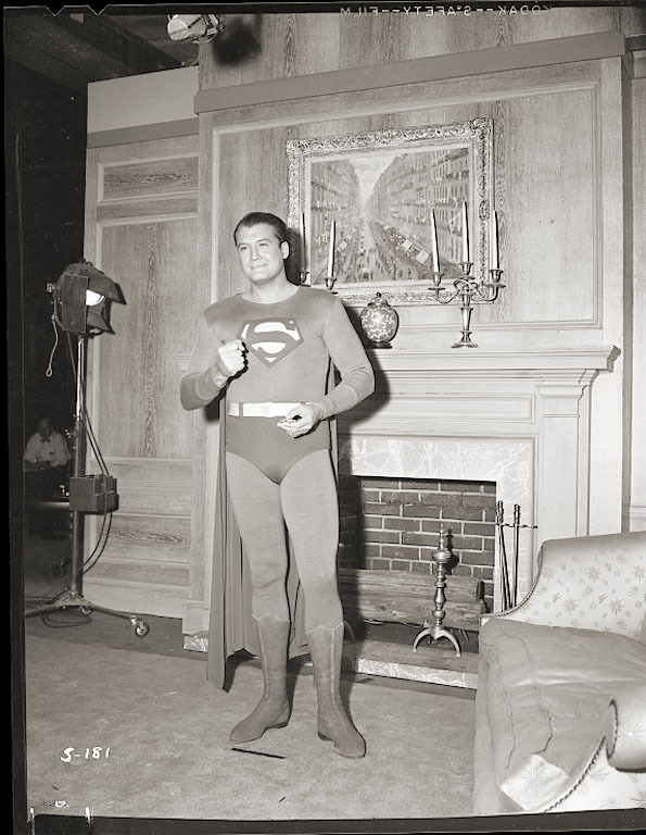
These Adventures of Superman costumes were routinely tossed when they got too ratty to film with; you can see some show episodes where quick-and-dirty repairs have been made to the costume. The very few costumes that still exist are in museums or in the hands of wealthy collectors; the last one that sold on auction went for a stunning amount of money:

The firm who made these costumes, and almost every other costume you ever saw in the movies or on TV, was Western Costume Company in the San Fernando Valley. They’ve been in business since 1912, outfitting thousands of costumes. They’ve fitted entire armies of extras and evidently they would make whatever a production company asked for and then rent it to them. They’d also rent them to other production companies later on; that’s why if you look at some TV shows with a keen eye, you’ll see costumes you’ve seen elsewhere. On the Adventures of Superman, the costumes used for the Science Council of Krypton were originally used on the 1930s Buck Rogers movies.
When the movie, Hollywood Kryptonite, about the life and mysterious death of actor George Reeves was made, they had to get permission from DC Comics to allow the Superman costume to be shown on film. They recreated the costumes (both the black-and-white and color versions) exactly, as shown in this photo:

Well, as a confirmed Superman fan, I had to get me some of those!
I lucked out by finding, after an exhaustive Web search, a woman out in the Midwest who was, if I remember correctly, the daughter of a Western Costume seamstress. She had the original templates, or at least one of the originals, the original felt and satin materials in the correct colors— and especially— the skills to recreate the TV-show emblems exactly for me. She agreed to make me two shirts each in the B&W and color versions if I supplied the T-shirts to sew them onto. I seem to recall she only charged me $17 per, which was a super-bargain!
Here are my cotton short-sleeved versions of the TV-show shirts, which were wool and long-sleeved (except for one episode, where you see Reeves wearing a short-sleeved variant under his suit jacket). My gray version is a tad too pale a shirt color, perhaps, and the blue shirt a bit too bright, but what the heck!
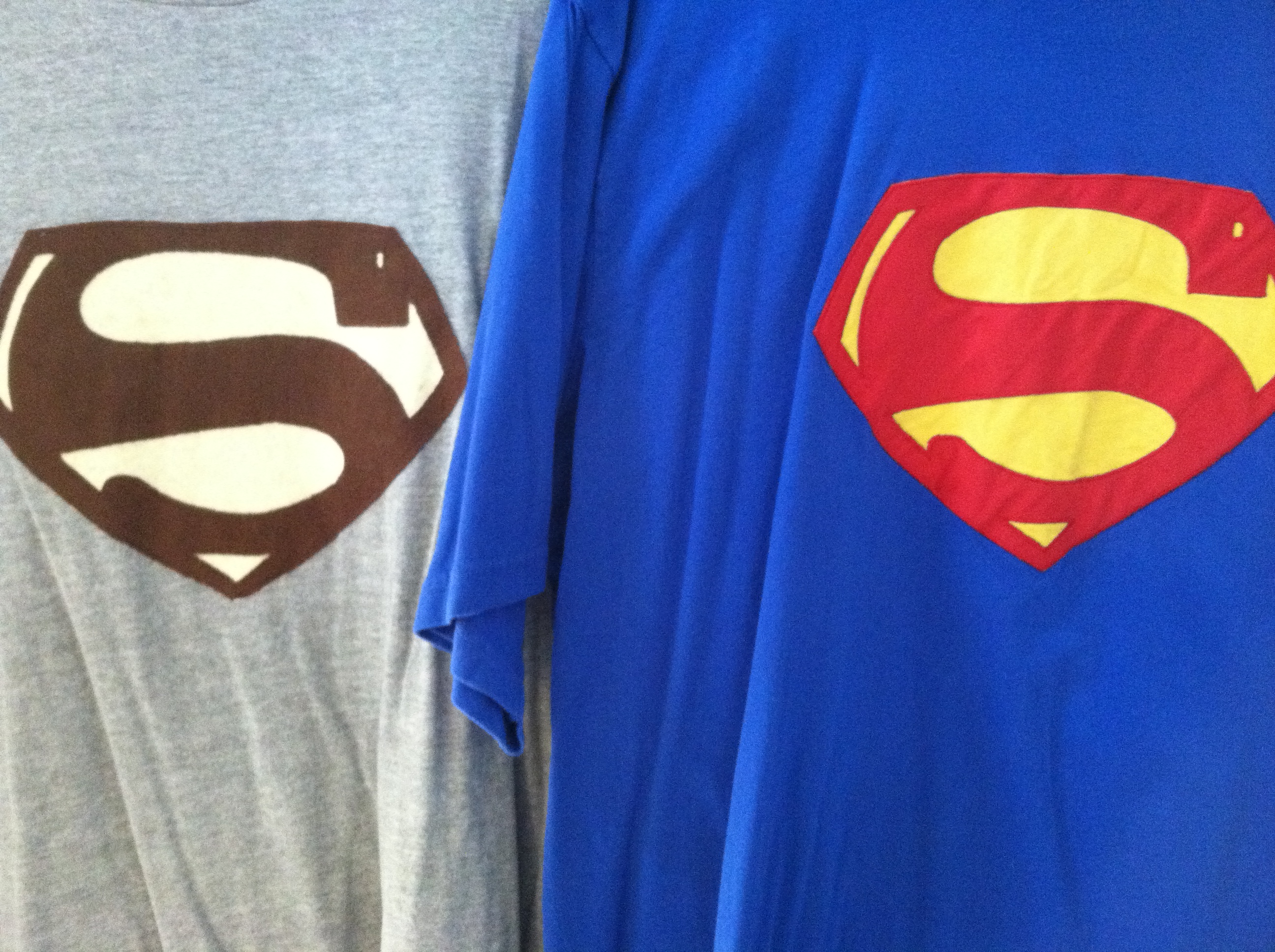
My dry cleaners love to see these when I bring them in for cleaning, and when I wear them somewhere, folks always ask, “Who do you think you are; Superman?!??!”
I, of course, reply, “No; this is to protect my secret identity; I’m really the Green Lantern!”
June 22, 2013
Comic Books, Strange and Pointless Adventures of Superman, DC Comics, George Reeves, Jack Larson, Jimmy Olsen, Kirk Alyn, Lois Lane, Noel Neill, Whitney Ellsworth Leave a comment
Look! Up in the sky! It’s a bird! It’s a plane! It’s Superman!
Yes, it’s Superman! Strange visitor from another planet who came to Earth with powers and abilities far beyond those of mortal men. Superman, who can change the course of mighty rivers, bend steel in his bare hands! And who, disguised as Clark Kent, mild-mannered reporter for a great metropolitan newspaper, fights a never-ending battle for truth, justice, and the American way!
That insistent intro to the mid-20th Century version of the Man of Steel came from the pen of Olga Druce, who wrote for the Superman series on the radio, before television was available to the average American. They had several variants of that intro on the radio show, and added the portion about the American way when the United States entered the Second World War.

To my generation, George Reeves, who played Superman and Clark Kent on the Adventures of Superman TV show from 1952 to 1958, was the real deal. He not only looked like Superman should look, but he was a wonderful Clark Kent. His version of Kent was better than what we’ve seen since, since his Clark Kent was really the focus of the show. He wasn’t particularly mild-mannered, as portrayed by Reeves, and he seemed like a genuinely good guy to have around. Superman was the guy who came on to wrap things up.

There are a lot of websites that provide an astonishing amount of info regarding this show, and I urge you to Google around and find them. The main purpose of my little blog entry today is to get one point across that has troubled me about the recent film and television versions of Superman: He’s portrayed by actors who are too young, in my opinion. They are excellent, but more Superboy than Superman.

Reeves was 38 when the Adventures of Superman began airing in 1952 and he was 44 when the show ended; he died the next year, either by suicide or murder, depending on whom you’re listening to. He was a bit player in the movies prior to the Superman show; he was in Gone With the Wind and some more forgettable movies. Prematurely gray, his hair had to be sprayed black for the show. The legend is that a DC Comics executive spotted Reeves on the beach in California when they were casting for the show. The executive, Whitney Ellsworth, thought the muscular fellow looked like the comic-book Superman, and was convinced he was the one they were looking for when Reeves put on his sunglasses; he then looked like a great Clark Kent! I suspect that today, George Clooney could nail the part.

Reeves was disappointed at first in his role as Superman; he remarked to the actress playing Lois Lane that they had reached the bottom of the barrel in their acting profession. But he was by nature a cheerful person, and embraced the idea of being a hero to American kids. The first season had a hard-assed version of Superman; he’d tell crooks he’d break every bone in their body if they didn’t cooperate and he killed a few people, or at least put them in situations that led to their deaths. Since this was very early TV, the special effects were primitive and low-budget; they used stock footage over and over. None of us kids probably noticed that when Superman was shown flying from left to right, his “S” emblem was backwards because they just flipped the film. I notice it now but it’s kind of cheesy-cool.
When the Kellogg’s cereal company signed on to sponser the show to promote their line of kid cereals, they insisted the producers tone down the angriness and violence. George Reeves became a kinder and gentler Superman, and the show was a hit. It has never been off the air since; the 104 episodes are available on DVD. The first two seasons were filmed in black-and-white, and the last four were filmed in color, though originally broadcast in B&W; no one had color TV at that time! If you watch the shows, and you may believe me when I say you’ll greatly enjoy them, pay particular attention to Jack Larson, who played Superman’s pal, Jimmy Olsen, and Noel Neill, who was Lois Lane from the second season on. They add so much to the show, in their earnest portrayals, and both are still alive and going strong today!

Clark, be careful; Jimmy’s right behind you!

Kirk Alyn as Superman
There had been an earlier film Superman, who made two serials or chapter-play Superman movies. The actor playing Superman/Kent was Kirk Alyn, who was a slender and graceful former ballet dancer. He looked great, but wasn’t particularly powerful in the roles. Reeves, a former boxer with the broken nose to prove it, was convincing as a brawler and made a more convincing Man of Steel. He looked good in his simple woolen costume, even though they had to pad his shoulders a bit, and though some folks today think he’s a tad pudgy, he was exactly what the kids of the early ’50s expected in their Man of Steel. I can vividly recall hearing, when I was in the second grade, that Reeves had died. None of us kids could believe it.

There will never be a better Superman than George Reeves.

April 14, 2013
Art, Comic Books, Old Jobs, Strange and Pointless, Weird aliens, Carmine Infantino, Comic Books, funny books, Gil Kane, Julius Schwartz, Murphy Anderson, planet Earth 2 Comments

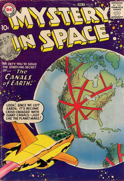
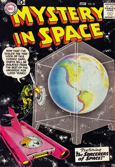
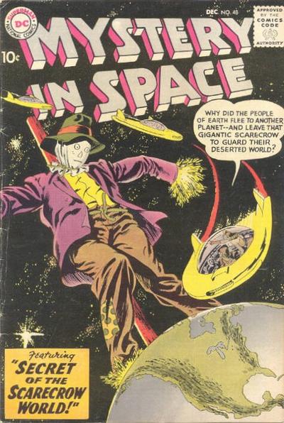
Don’t worry; today’s entry has nothing to do with Al Gore. It’s all about something much more compelling, realistic and important: Comic-book covers!
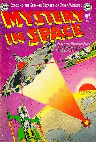
Mystery in Space, a DC-published comic that ran for 110 issues from 1951 to 1966, was one of my favorites. Edited by the amazing Julius Schwartz, it featured art by some of my favorite artists: Carmine Infantino, Gil Kane, and Murphy Anderson.

When I tippytoed into the world of professional comic-book production for a couple of summers while in high school, the first thing I learned was that the covers sold the books. It was no accident that the covers of comic books were printed on glossy coated stock using high-resolution screens while the interiors were tossed off on newsprint with coarse screens and muted color reproduction. The art on the covers was almost always much better than what was found in the interiors of the book. So what? It was a stricture of the art form, and covers were what sold the books.
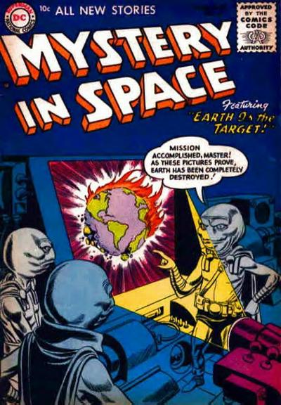
One of the leitmotivs of DC-comics covers, along with purple gorillas, Jimmy Olsen turning into something weird and Lois Lane in trouble, was perils to Earth. In the Mystery in Space books, editor Schwartz took this to a high level in the early days of the series. For pre- and early-teen American boys, this had resonance: we were just beginning the American space program, and who knew whether this might set off some trip-wire arranged long ago by aliens? It was worth staying up at night to worry about!!! Also, and even more unsettling, these covers indicated that it was the Northern hemisphere that these evil aliens were focusing on. They could care less about Europe, Asia, Africa; their eyes were on the U.S.A!!!

Were aliens watching our every move? Probably! Were they thinking “Hmm; the primitive Earthlings have now reached the stage where they have both atomic weapons and the ability to rocket into space. We’d better smush them like bugs before they prove troublesome to us!!!”? What a burner for our species, huh?
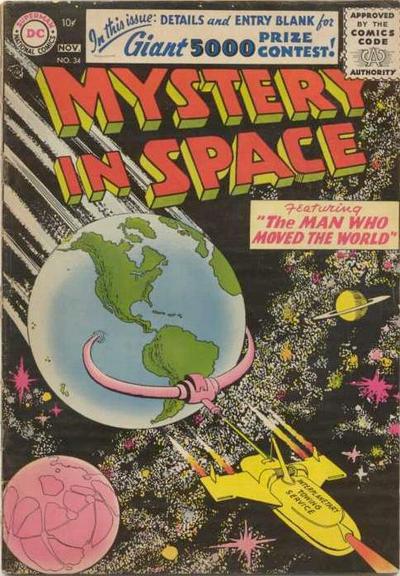
So we kids would look for, buy, read and re-read these comics. So what if this clarion cry came from a funny book? The guys who wrote and drew them were obviously smart; look at all the scientific facts crammed into these stories!

Here are, for your enjoyment and amusement and so you can prepare for our destruction, some of the great Mystery in Space covers showing Earth in peril.
BE WARNED! THE ALIENS ARE OUT THERE AND THEY’RE WATCHING US!!!


January 21, 2013
Cars I've Known, Comic Books, Family Fun, Strange and Pointless Batman, Batman TV show, Batmobile, Corgi, Julius Schwartz, Marathon, sale of Batmobile 9 Comments

Today’s sale of the original TV-show Batmobile reminded me of my slight brush with the history of the various versions of the car.
A kid in the 1950s and ’60s could be a fan of both Superman and Batman, and I was, but Batman had a couple of extra things going for him: he had a cave and he had a cool car. The primary Batmobile of the 1940s was a good-looking unit, and no other comic-book character had anything remotely as cool as this:

In 1950, the editors of the Batman comics decided it was time to update the Batmobile, and this one was born:

This 1950 Batmobile had a crime lab built into the back seat and still had the spooky and amazing front bat-face thingie and the neat swooping rear fin. Not a thing wrong with this baby:

But by the mid-1960s, even I had to admit that 1950s Batmobile, still used in the comic books, was dated-looking.
We had just moved down to Marathon, Florida, and I had time on my hands. So, I decided to create a more modern Batmobile. I chose the front end of a Pontiac of the era and the back end of a Chrysler; combining those was easy; then I added a couple of canopy bubbles like fighter planes had. And, to top it all off, I added a couple of hood and side scoops like Corvettes had. I made sure it had a bat face on the front and two bat-fins on the back!
I drew a really clean version of the design and sent it to Mr. Julius Schwartz, an editor at DC Comics who seemed to encourage kids to become involved in the books.
I promptly forgot about the whole thing until a few months later, when a postcard came from Mr. Schwartz; he always wrote on postcards. He was going to use my Batmobile in the comic books! And– WOW– I would get a free one-year subscription to all the comics he edited. He edited a bunch of good ones, too: Batman, Atom, Green Lantern, Hawkman, Flash, Justice League of America!
Here’s what my version of the Batmobile looked like when it appeared in the comic books:

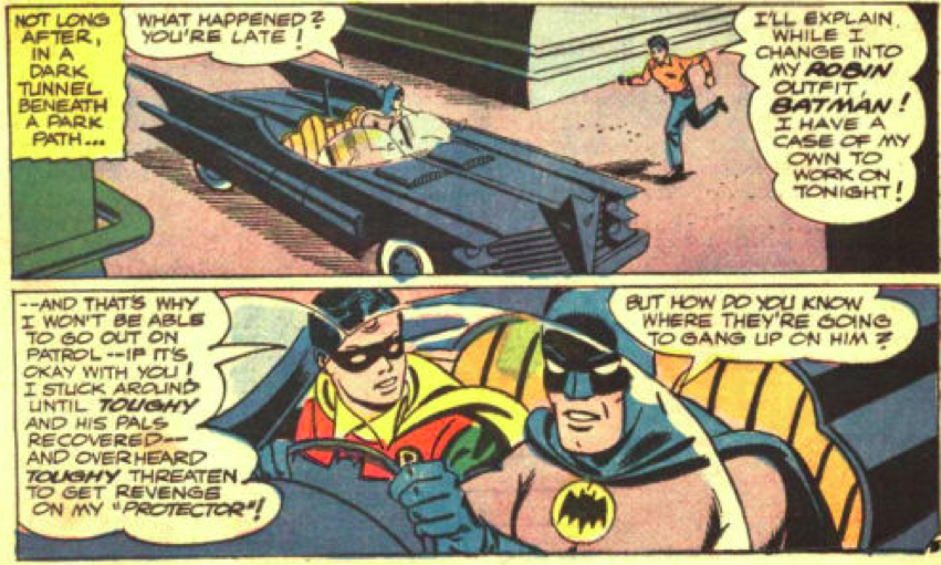

I was so proud! Then the TV show came out, and the Batmobile on the show made mine look like crap.
Here are a couple of photos of the TV-show Batmobile taken before it even had its glossy paint job; it’s still wearing its flat-black primer:


I was devastated at first, but then figured, “Okay; they have pro guys designing TV-show cars and I’m just a kid! No wonder their’s looks so much better!!!”
One problem was that I could no longer tell my pals I had designed the Batmobile, because the first thing they’d say would be, “THE TV-SHOW ONE?!?!?!” And I’d have to reply, “No; the lame one they use in the comic books and comic strip.”
Eventually– and we’re talking over a year; maybe more– I grew sick of seeing my Batmobile in the books and strips and wrote to Mr. Schwartz again: “Why do you keep using my Batmobile design when the TV-show one is ten times better looking?!?!?!” And a few weeks later, a DC Comics postcard came with his response: “Yours is easier to draw.”
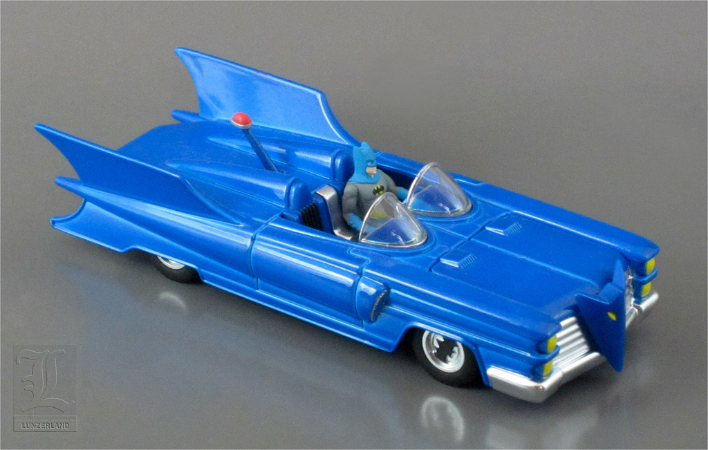
Oh, well. They’ve come out with a 1:43-scale Corgi die-cast version of my Batmobile, which is one of the rarest and costliest Batmobile die-cast models because it is lame-looking compared to the TV-show one and not much sought after. A very generous Batmobile historian and enthusiast in England was nice enough to send me one a couple of years ago; I darn sure wasn’t going to spend over $250 for it on eBay!!! Too bad they used a baby-blue paint for the color:
Yes; I’m proud of my lame creation, but, to me, there is only one Batmobile, and it isn’t the one I dreamed up sitting on the side of my bed in Marathon, Florida, and it isn’t the ones in the comic books and strips and it sure isn’t any of the recent Batman movie Batmobiles; it’s this:


