Home

I left my hubcap in San Francisco . . .

Leave a comment

Steve's Pony Car

For those who think a gee-whiz car is one running on a massive array of nine-volt batteries, move on. There’s nothing for you here. Personally, I got over electric cars when Mom threw away my slot-car set. If they ever develop an electric passenger plane, I’ll look up to see that.

But for those of us who got our driver’s licenses in the mid-1960s, this is for you. It’s also for those who weren’t lucky enough to live in the days of the American muscle car and 19-cent-a-gallon gas! You missed it, Grasshopper!!!

Bad Charger

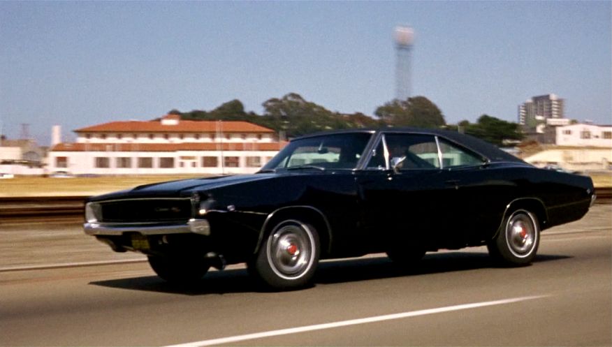
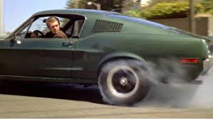
The 1968 movie Bullitt starred Steve McQueen as a rogue cop. At least, that’s what the marquee on the Naples theater said. But the real stars of the show were a dark-green ’68 Mustang GT 390 and a shiny-black Dodge Charger R/T 440. The chase is shown here in three parts. Please view them full-screen with the volume way up. I want you to hear every double-clutching sound and see it all.

I’ve seen websites that show the San Francisco locations of this chase, and some of them are miles apart from what the movie shows. But it’s a movie, okay?!?!? And did this thing MOVE! Parts of this movie were a drag; I didn’t like seeing the Man from U.N.C.L.E.’s Robert Vaughan as a bad guy, for one thing. But the chase made up for it. Enjoy, my little motor-heads!

We start with the prelude, and the chase begins in the second YouTube clip. Sorry about the ads before the scenes, so stop your whining.

Several years after this movie, not being a Ford fan, I bought a brand-new Charger with a 440. As I’ve mentioned here before, it was a dog; a real bow-wow. So it goes. I wasn’t in San Francisco anyway.

1974-dodge-charger-special-edition

BONUS!  In 2006, Ford created a wonderful Mustang commercial, riffing off Field of Dreams, starring Steve McQueen, who had died in 1980. McQueen’s wearing what he wore in the Bullet chase and it’s just a brilliant ad.

Small-print edition!

3 Comments

From our friends at Shorpy.com comes this fascinating image of a young woman working in the big city in 1956. Notice the book under her manuscript and the hand-held magnifier next to it.

NYC Career Girl, 1956I suspect the book in the photo above is a variant of the Compact Oxford English dictionary. The one I have is from the 1970s and the pages are set up a little differently. The magnifier that came with my COED is the same as in the Shorpy.com photo.

Because the full OED is 20 volumes, the compact editions are composed of multiple pages reduced so that several pages fit onto a single page, if you follow me. That makes the looking glass essential to reading the entries. Even with the pages crammed in so tiny, my COED is still a bulky two volumes.

OED

Here’s a photo from the Web showing a modern-day COED. The looking glass or magnifier provided with the books nowadays seems to be a nifty round one with no handle.

Compact OED

An amazing resource for us word nerds.

My favorite dictionary for just reading—and you know you’ve got it bad when you collect and, yes, read old dictionaries—is my hardback facsimile of Noah Webster’s first American dictionary, as published in 1828. It’s fun to see how our language has changed since Webster’s day.

American Dictionary of the English Language


The Quest: A journal that likes fountain pens!

5 Comments

It’s that time of year again, when I search for an office journal that is fountain-pen friendly!

Journal with Fountain Pen

As the photo below shows, bleed-through is an annoying problem, as I use both sides of the paper and I also write with medium, wet-writing nibs (usually Sheaffer or Parkers). So please wish me luck on this important quest. My current office journal is nice, but the bleed-through drives me nuts (please; no remarks about what a short little drive that is).

IMG_1729

The notebook I’m currently using is a Gallery Leather Desk Planner 9-1/2″ x 7-1/4″ journal. It has detailed color maps of the world, important toll-free number and website info, and is printed on a pretty cream-colored smooth paper. The leather cover is thin and bendable, which I like, and the pages are gilt-edged, which adds a classy touch. But the bleed-through is a deal-breaker for me. Since I’ll be paying for my journal myself–no freebies at this blog–I won’t be reporting on a wide sample, but you’ll learn how my search progresses. Isn’t this exciting?!?!??!

UPDATE:

After exhaustive research—and I’m not kidding you—I opted for the Black n’ Red Executive Notebook, which is an 11-3/4″ x 8-1/2″ linen-lined hardcover journal with 192 gray-lined pages, 33 lines per page. These have sewn bindings and the pages show—at least with a Mont Blanc fine nib and my favorite Levenger amethyst ink—absolutely no bleed through in the little test I did on a back page. I won’t be using these—I got a couple from Amazon at about $15 a pop—until the new year rolls around, but I have high hopes! These also have color geographic and Metro maps, which are neat if not vital to the mission. They look understated, stylish, and businesslike, and there’s a little red ribbon for keeping track of what day you’re on. I’ll keep updating this blog entry as time goes on so keep an eye out for updates!