Home

DC Comics History: Get This Book!

2 Comments

Image

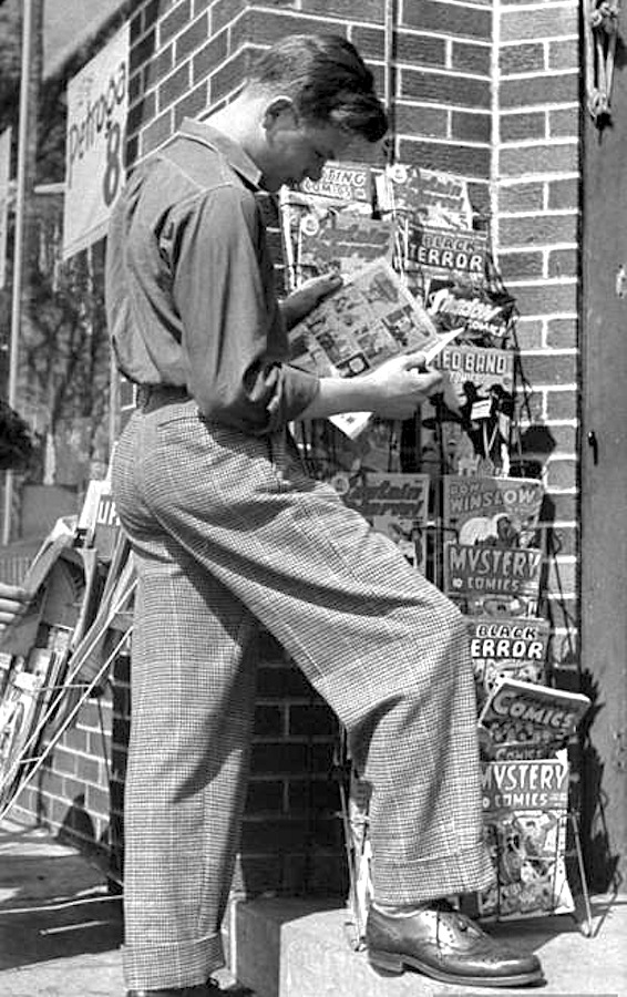
A precursor of The Office’s Jim Halpert looks at comics on sale. Oddly enough, not one DC comic on this rack. Based on the cover of Don Winslow of the Navy #26 and Red Band Comics #4 or 5 (both used the same art!), this was taken in March of 1945.

As a kid, I would read any comic book I could get my hands on, but my favorites were DC Comics. The writing, characters and production values were, to me, the best of anything out there. I liked other brands, like Harvey, Archies and Dell, but DC was tops.

Marvel Comics, at that time, was not making superhero comics; their offerings were mainly books about monsters or takeoffs on comics produced by other companies. If Harvey Comics put out Casper, the Friendly Ghost, Marvel would put out Homer, the Happy Ghost, and Charlton Comics, the bottom of the barrel in production values, put out Timmy, the Timid Ghost. One day, I’ll do a blog entry on the laughable print quality of Charlton Comics; they were usually printed so far out of register that they looked like the old red-blue 3-D comics.

So it was mainly DC for me!

My primary fascination was the drawing, but I was also intrigued by the production aspects of the things:

• How did they get from typewriter and pencil to the finished book?

• How did they print the 64 colors used?

• How come some comics used line screens for colors and some used dot screens?

• How did they get the logos and such so perfect on each issue?

• Who owned the company (DC at that time was called National Periodical Publications, Inc)?

• How did all the drugstores and newsstands get these books on the racks every other Tuesday morning?

• How much did the ads in the books cost and did they bring in dimes from the readers?

• How many copies of each comic did they print?

• How come some comics were monthlies and some were bi-monthlies?

• Why was the cost a dime?

What kind of company makes comic books?!?!??

Image

When I was a kid, drugs stores were the best place to buy comics, as they seemed to carry all the issues published. Based on the cover of Action Comics #243 in this photo, it was taken in May of 1958. Yes; I am a geek! Had this photo been taken in Pascagoula, Mississippi, that could have been me in the pale jacket reading Strange Tales #65.

That was the stuff I wondered about.

I needed the following book: 75 Years Of DC Comics: The Art Of Modern Mythmaking, written by Paul Levitz, former president and publisher of DC Comics.

Image

Nice touch: The title lettering mimics the lettering used on DC’s Action and Adventure comic book titles.

720 pages in a large, 15-1/2″ x 11-1/2″ format, weighing in at about 15 pounds, this is a stunner of a book. Absolutely engrossing, written in an amusing yet authoritative style, it’s simply the best history of comic books out there, and I’ve read ’em all. It’s expensive at over $150, but if that’s what it costs, so be it. It’s well worth more than that.

The book, heavily illustrated with comic covers and interior pages as you might expect, is augmented by rare photos of DC folks, from founders Malcolm Wheeler-Nicholson, Harry Donenfeld and Jack Liebowitz to production folks like Sol Harrison, Jack Adler, and, of course, many of the art and writing talents from DC’s history. Associated media, like cartoons, TV shows and films are well covered, too.

For me, whose interest in primarily in the marketing and print-production aspects of the comic books, a fascinating discovery was the cover/sales chart sheets kept by Irwin Donenfeld, Irwin was the son of DC co-founder Harry Donenfeld, and was co-owner, editorial director and vice-president of DC from about 1948 to 1968. These hand-drawn charts showed the covers of each DC comic by month, with notations of the size of the print run and percentage of copies sold written under each cover.

Image

Notice the Batman logo change on this series of covers from the mid-1960s; one of Irwin Donenfeld’s sales charts.

Brilliant.

75 Years of DC Comics: Buy it, borrow it or check it out from a library; it is an amazing piece of work! You will learn something new on every page and the visual appeal is breathtaking. Here’s the Barnes & Noble info:

http://www.barnesandnoble.com/listing/2684868360209?r=1&cm_mmca2=pla&cm_mmc=GooglePLA-_-Book_45Up-_-Q000000633-_-2684868360209

Look! Up In the Sky!!!

Leave a comment

Look!  Up in the sky! It’s a bird! It’s a plane! It’s Superman!

Yes, it’s Superman!  Strange visitor from another planet who came to Earth with powers and abilities far beyond those of mortal men.  Superman, who can change the course of mighty rivers, bend steel in his bare hands!  And who, disguised as Clark Kent, mild-mannered reporter for a great metropolitan newspaper, fights a never-ending battle for truth, justice, and the American way!

TAOS Title

That insistent intro to the mid-20th Century version of the Man of Steel came from the pen of Olga Druce, who wrote for the Superman series on the radio, before television was available to the average American. They had several variants of that intro on the radio show, and added the portion about the American way when the United States entered the Second World War.

American Way

To my generation, George Reeves, who played Superman and Clark Kent on the Adventures of Superman TV show from 1952 to 1958, was the real deal. He not only looked like Superman should look, but he was a wonderful Clark Kent. His version of Kent was better than what we’ve seen since, since his Clark Kent was really the focus of the show. He wasn’t particularly mild-mannered, as portrayed by Reeves, and he seemed like a genuinely good guy to have around. Superman was the guy who came on to wrap things up.

Clark Kent George Reeves

There are a lot of websites that provide an astonishing amount of info regarding this show, and I urge you to Google around and find them. The main purpose of my little blog entry today is to get one point across that has troubled me about the recent film and television versions of Superman: He’s portrayed by actors who are too young, in my opinion. They are excellent, but more Superboy than Superman.

Stern Superman

Reeves was 38 when the Adventures of Superman began airing in 1952 and he was 44 when the show ended; he died the next year, either by suicide or murder, depending on whom you’re listening to. He was a bit player in the movies prior to the Superman show; he was in Gone With the Wind and some more forgettable movies. Prematurely gray, his hair had to be sprayed black for the show. The legend is that a DC Comics executive spotted Reeves on the beach in California when they were casting for the show. The executive, Whitney Ellsworth, thought the muscular fellow looked like the comic-book Superman, and was convinced he was the one they were looking for when Reeves put on his sunglasses; he then looked like a great Clark Kent! I suspect that today, George Clooney could nail the part.

George Playing His Guitar

Reeves was disappointed at first in his role as Superman; he remarked to the actress playing Lois Lane that they had reached the bottom of the barrel in their acting profession. But he was by nature a cheerful person, and embraced the idea of being a hero to American kids. The first season had a hard-assed version of Superman; he’d tell crooks he’d break every bone in their body if they didn’t cooperate and he killed a few people, or at least put them in situations that led to their deaths. Since this was very early TV, the special effects were primitive and low-budget; they used stock footage over and over. None of us kids probably noticed that when Superman was shown flying from left to right, his “S” emblem was backwards because they just flipped the film. I notice it now but it’s kind of cheesy-cool.

Reeves On Set

When the Kellogg’s cereal company signed on to sponser the show to promote their line of kid cereals, they insisted the producers tone down the angriness and violence. George Reeves became a kinder and gentler Superman, and the show was a hit. It has never been off the air since; the 104 episodes are available on DVD. The first two seasons were filmed in black-and-white, and the last four were filmed in color, though originally broadcast in B&W; no one had color TV at that time! If you watch the shows, and you may believe me when I say you’ll greatly enjoy them, pay particular attention to Jack Larson, who played Superman’s pal, Jimmy Olsen, and Noel Neill, who was Lois Lane from the second season on. They add so much to the show, in their earnest portrayals, and both are still alive and going strong today!

Clark, be careful; Jimmy's right behind you!

Clark, be careful; Jimmy’s right behind you!

Kirk Alyn as Superman

Kirk Alyn as Superman

There had been an earlier film Superman, who made two serials or chapter-play Superman movies. The actor playing Superman/Kent was Kirk Alyn, who was a slender and graceful former ballet dancer. He looked great, but wasn’t particularly powerful in the roles. Reeves, a former boxer with the broken nose to prove it, was convincing as a brawler and made a more convincing Man of Steel. He looked good in his simple woolen costume, even though they had to pad his shoulders a bit, and though some folks today think he’s a tad pudgy, he was exactly what the kids of the early ’50s expected in their Man of Steel. I can vividly recall hearing, when I was in the second grade, that Reeves had died. None of us kids could believe it.

George Reeves At Home

There will never be a better Superman than George Reeves.

George Reeves Color

Hawkaaaaaaaaaa!

4 Comments

In the 1960s, there were a number of great superhero or adventure comic books featuring groups. There was the Justice League of America, the Fantastic Four, The X-Men, The Avengers, The Legion of Superheroes, The Doom Patrol, The Teen Titans, Sgt. Fury and His Howling Commandos, The Mighty Crusaders and others. I enjoyed all of them, but my favorite was Blackhawk.

Mighty Blackhawk

The Blackhawks first appeared as the lead feature in Military Comics in the the summer of 1941, before the attack on Pearl Harbor started World War II. They soon had their own comic book. The legendary Will Eisner had a hand in their beginnings; he was either editor or creator, depending on who tells the story. “Hawkaaaa” was their battle cry and they usually ended an adventure flying off the bottom panel of the comic-book page while singing a victory song.

If you want to learn much more about the origin of the Blackhawks, here’s a blog by a fellow Maryland WordPress blogger that is well worth your attention:

http://fourcolorglasses.wordpress.com/2012/06/11/the-origin-of-blackhawk-military-comics-1-august-1941/

Here are the first Military Comics and Blackhawk covers; the first Blackhawk comic was #9 because Quality Comics used their U.S. Postal permit from their cancelled Uncle Sam Quarterly:

First Blackhawk Appearance

First Quality Comics Blackhawk

After WWII ended, Military Comics changed its name to Modern Comics. Here’s the first cover with the new name:

First Issue Modern Comics

All these were issued by the Quality Comics company and the artwork was just wonderful. It was realistic, gritty and the Blackhawks had great uniforms and equipment. The airplanes alone were enough to draw one’s interest, though the stories were compelling; full of nasty men and women who were all defeated by the Blackhawks. The women were unfailingly attractive; and nearly all of them fell in love with Blackhawk, who was the Polish-born leader of the seven-man team.

Please know that the Quality-era Blackhawks weren’t politically correct if viewed with a 21st-century mindset; one of my buddies on a Lincoln history forum has a great quote worth remembering:

The Past is a foreign country . . . they do things differently there”

— L. P. Hartley

Screen Shot 2012-11-30 at 7.09.04 PM

In the panel above, the earnest young lady’s dad, who was making earthquakes and avalanches in South America for the benefit of the commie empire, is going to prison for life, but all she can think of is how cool Blackhawk is! Hawkaaaaaaaaaaa!!!

In 1956, Quality Comics sold the rights to their characters to DC Comics, and DC continued Blackhawk. Here’s the first DC issue:

First DC Blackhawk

Note that the comic-book title is singular but the team name is plural. The DC Blackhawk had the same artists and some of the same writers, but instead of fighting Nazis and commies, the Blackhawks were often fighting super villains and monsters. No matter; they were still a great read.

After a couple of years, DC decided to fiddle with the formula and the Blackhawks were clothed in what one commentator has described as uniforms better suiting valet parking attendants:

Blackhawk 199

The stories and art were still okay, but a couple of years later, during a strange comic-book interlude that began with the campy Batman TV show and the James Bond/Man from U.N.C.L.E. fads, the Blackhawks were turned into an embarrassingly inept group of semi-superheroes, with silly names and even sillier costumes. It didn’t last long and to make things worse, some of the big-time DC comics heroes introduced this horrible concept on the front cover!!!

Blackhawk 228

I refuse to show you the new uniforms the Blackhawks wore during this period. They are painful to behold.

After several terrible issues, the decision was made by the DC honchos to cancel the title.  At the same time, a talented artist and editor, Dick Giordano, came to DC from the Charlton Comics company. He loved the original Blackhawks and when he took over the comic, he tried for two issues to bring back the original concept, including the black leather uniforms. It was too little too late. Blackhawk was cancelled in 1968.

DC has had a few revivals of Blackhawk since then but they never seemed to catch on, for whatever reason.

So why am I telling you all this?

Because for several years I have had an idea for a great Blackhawks revival! It would be composed of a group of young black men and women, and I think the concept would be interesting and fun. I’ve given this a lot of thought and may well put it all down on paper one day and send it off to DC Comics.

Hawkaaaaaaaaaaaaa!!!

I Like the Way You Walk!

Leave a comment

Any kid who read comic books in the 1950s and ’60s– and what kid didn’t?– had to have read a story or two that involved Easter Island statues either being alive or being brought to life to attack mankind. These statues, properly called Moai, were built between the years 1250 and 1500 and they are huge. Hewn from rock quarried on the island, they can be as tall as 33 feet– almost as high as a three-story building– and weigh over 80 tons. There are over 850 of these amazing statues scattered over the island. Some are buried in the earth up to their necks, but their bodies are under the soil, ready to erupt from the earth and smush us whenever they feel so inclined.

These Moai originally sported red stone hats, made of a different stone than the bodies, but that’s something not essential (as if anything could be) to this little post.

But comics with walking Easter Island statues were guaranteed to creep out the bravest kid and, most importantly, get his money out of his pocket and into the cash register!

Here’s a classic example, drawn by Jack Kirby for DC Comics’ House of Mystery, cover date April, 1959:

Here’s another Kirby cover, this time drawn for Marvel/Atlas’ Tales to Astonish, cover date February, 1961:

Here’s a third from either Ron Wilson or Larry Leiber for Marvel’s Chamber of Chills, cover date July, 1974:

And finally, another Kirby example from Marvel’s Tales of Suspense, cover date April, 1962:

Why am I bringing this up? Because I just read a Scientific American article by Nature writer Ewen Callaway which describes how the folks living on Easter Island got these ungainly statues from the rock quarry to the platforms made for them. Evidently, they walked them into place!

Here’s a YouTube video of this being done and you have to admit, it’s rather creepy!

Great Spirit Comic Books!

2 Comments

I first encountered Will (or Bill, as the old comics guys called him) Eisner’s Spirit comics when I got a copy of Jules Feiffer’s The Great Comic Book Heroes. This stunning book, which I got for Christmas in 1966, was a chance for a 1960s kid to see for the first time what comic books had been like in the 1940s. Living in the Florida Keys, where we had moved earlier in the year, I had few chances to find old comic books for sale.

Oddly enough, while snorkeling one day, I discovered a stash of old comics that someone had evidently thrown overboard long ago in and around the marina outside our home in Marathon Shores. These comics were coverless and half-buried in the sand and silt about 15 feet deep on the salt-water side of the island where we then lived, but I’d dive for them and leave them to dry on the dock outside our house. Once dried, they were perfectly readable, if rather crinkly, and I was able over the summer to get 20 or 30 old DC comics in this fashion.

So I was primed to learn more, and Feiffer’s superb book was right up my alley. I then sent a letter to the Miami Herald asking where old comic books could be found, and they printed my letter and listed some shops in Miami that sold them. Armed with that info, I bugged my dad until he finally agreed to fly me the 107 miles to Miami!

One odd thing my dad did was keep $50 cars at a few airports he flew in and out of a lot. He’d never pay more than $50 for the cars, so they weren’t too spiffy, but they saved him the trouble of renting cars. We drove in whatever clunker Dad had stowed in Miami to several of the stores that the Herald had listed, and I was finally able to get a copy of a 1940s Spirit comic book. The Spirit feature had originally been part of a 16-page Sunday newspaper comic supplement from about 1940 to 1952, and Quality Comics had printed a magazine in the mid- to late-1940s showcasing the character. Eisner, being nobody’s fool, was smart enough to keep the copyrights and that was unheard of in comics at that time.

Will Eisner was a solid pro not only at writing and drawing comics, but in print production. He, by the time we’re discussing here, had moved on from newsstand comics to producing preventive maintenance monthlies for the U.S. Army. One of my uncles had given me some of those, as they had a ton of great Eisner artwork in them, and they were unsurpassed in explaining technical issues in a simple and understandable way. I still have a stack of these P.M. magazines somewhere in the basement, much to Patty’s dismay.

Eisner’s Spirit stories, and there are about 250 of them, I guess, were way above the norm for a comic book. They weren’t aimed at nine-year-olds, for one thing, and Eisner had a tight group of amazingly talented assistants who helped write and draw the stuff. Jules Feiffer had been one of these ghosts for Eisner.

Nowadays, Eisner’s Spirits are easily found in both comic-book form and in hardback, and much of the work is also available in digital form, if you know where to look. In the late 1960s, it was very different and Spirit comic books were few and hard to find.

There had been a couple of 64-page color reprints by Harvey Comics in 1966 and ’67 and those were comic books to be treasured; beautifully printed and colored. My next Spirit encounter was in what were called Spirit Bags in the early 1970s. These were 6″ x 9″ black-and-white reprints of the 8-page Spirit stories and had a typed commentary by Eisner on the last page. Still have all those, too.

Over the years I snagged a ton of other Spirit reprints, both in hard copies and in digital form. I recently learned that Fiction House, a second-tier comic-book publisher, had issued five Spirit comics in the early 1950s. I had never heard of them before, but Fiction House really did a nice job on these reprints of the newspaper Spirits. The coloring is amazing, especially when you consider that they only had 64 colors and tints to work with in those old days.

I now have these in digital form and they are a treat. If you have an interest in Eisner’s work, I encourage you to download them; here’s a site:
http://digitalcomicmuseum.com/index.php?cid=932

These are in the public domain. You’ll need a PC, Mac or iOS reader for the files; they’re easy to find. I particularly enjoy the Comic Zeal iPad app; it makes organizing the hundreds of comics on my iPad a snap.

Thank me later!!! Enjoy!!!

Side Note:

A couple of years later, when we started a student newspaper at Naples High, I made damned sure that the newspaper was called The Spirit, and I worked for days on a masthead for it; my crude homage to Will Eisner. Of course, Eisner, who was so gifted that he came up with a different and stunning masthead for each and every Spirit story, was in a much different league than I was and I cringe to look at my crude Spirit newspaper masthead now!

So it goes!

Joe Kubert Has Passed . . .

27 Comments

I never met Joe Kubert in either of my stints in the comic-book world, but I spoke with him on the phone a few times. Mr. Kubert, a pioneering artist who worked mainly for DC Comics, had started a school for cartooning and graphic arts in Dover, New Jersey. There were two young friends and employees of mine in whom I saw great potential.

I spoke with Mr. Kubert about them both. These conversations were about ten years apart, but Mr. Kubert had the same two questions about the young men I was touting: “Are they good? Will they listen?”

Both young men attended his school to their decided benefit. He and his staff taught them what they needed to know to augment their talent with real-world chops. After a couple of years at the Kubert School, both these young men were not only pro-level cartoonists, but could handle any graphic assignment someone might throw at them. They not only knew the theory but how to get it done without a lot of floundering around. Both young men have done well in their careers, thanks to Joe Kubert. There are many others who can say the same thing.

When I first saw Joe Kubert’s work, in some of the DC war comics, I didn’t like it. It was gritty and a tad ugly to my eye.

Then I saw his work on the revamping of the Hawkman feature in the early 1960s. His work on Hawkman soared; it was lyrical and clearly showed the joy and freedom of flight.

Thus I began to realize that Joe Kubert was simply a better artist than I had encountered before. He was capable of creating more than pretty drawings; he was gifted enough to produce emotional drawings based upon realism. War was ugly, so he drew it ugly; flying was about grace in the air, and he drew it that way.

His composition skills were equal to his draftsmanship; he did tons of covers for DC where his covers were the best thing about the book and where the poor artist who did the interior pages just wasn’t Kubert’s equal.

He was a pioneer, yes, but he also was driven to teach what he had learned to new generations of artists. He gave back and provided leadership to many young people who will carry his legacy into the future.

Thanks, Mr. Kubert.

Sorry, Kid . . .

3 Comments

Here’s the announcement DC Comics had on their inside front covers in December, 1961, announcing their 20-percent price increase to twelve cents an issue. I can clearly remember that, though I was only nine years old at the time. Notice the prices of other items DC mentions in this “letter” to the boys and girls who bought the comic:

Of course, the other comic publishers quickly jumped on the bandwagon; Dell Comics, who outsold everyone with their Disney/Warner Brothers-licensed comics and movie/TV-adaptations, went to fifteen cents for a 36-page comic earlier in 1961, at least for a while. From the sales figures I’ve seen, and some folks have published a lot of info on this, sales of comics went into a decided slump after this increase and the slump lasted for a long time. Marvel had just begun their superhero output with the Fantastic Four, but one of their pre-hero monster comics lost 30-percent of its sales.

Today, when a DC or Marvel Comic costs three or four dollars, a couple of pennies doesn’t seem like a big deal, but it was to a kid back then.

For our younger readers, here are some common prices and such from 1961, by way of comparison:

Average cost of new house: $12,500.00
Average income per year: $5,315.00
Cost of a gallon of gas: 27 cents
Average cost of a new car: $2,850.00
23″ black-and-white television: $219.99
Bacon, one pound: 67 cents
Loaf of bread: 20 cents
Eggs, per dozen: 30 cents
Ounce of gold: $35.25

Great Scott!

Leave a comment

As a kid, I loved comic books and the one I loved the most was DC’s World’s Finest Comics. It had originally started as New York World’s Fair Comics, in 1939. Then it became World’s Best Comics and finally World’s Finest Comics. Its early issues were 96-pagers, but soon settled in at 76 pages for fifteen cents for many years. Superman and Batman each had their own stories, along with a bunch of lesser characters.

The covers showed Superman and Batman together in a poster setting that had nothing to do with the contents of the books. All this was way before my time. The page count began slimming down by the late 1940s, as seen here, but the price stayed at fifteen cents. I have to wonder how many of these comics were sold at a dime, since that was the going rate for a comic book.

In 1954, when things got tough for comics publishers, DC changed the format to 36 pages (including the covers), cut a lot of the secondary features and reduced the price to ten cents, like most all other comics. They also combined Superman and Batman into one story, which seems an obvious move after all those previous covers showing them both together. Those are the comics I loved; they gave great value for your dime. The art was crisp and well-drawn; the stories were interesting with intriguing plots. And the idea of superheroes being friends was wonderful to a kid.

The Justice League of America, which came out a few years later, had most all the DC heroes, including Superman and Batman, but the art was lame and the stories confusing with seven or eight heroes bouncing around. World’s Finest was more to my liking. Now, too, the covers related to the stories found in the issue.

For about 50 issues, World’s Finest Comics were a real hoot, and there were two things about the covers I really liked. Usually, someone (Superman, Batman or Robin) would exclaim, “Great Scott!” at whatever was going on.

And Robin, being rather a fifth wheel, would often be stuck in the bottom corner of the cover.

My favorite covers had both the Great Scott! AND Robin in the corner.

I don’t believe I’ve ever heard a real person say, “Great Scott!” but comic books were aimed at 12-year-olds, and the publishers had to be careful. The very early Superman used a lot of “What the–“ exclamations, and the reader could fill in the blank but that only lasted a couple of years. Thus, “Great Scott!” And see that “Still 10¢” in bold type on the pink cover? That was a hint that something was in the works at DC, and it wasn’t good.

After a while, someone at DC must have issued an order about these recurring items, and Great Scott! was replaced with a couple of Great Kryptons! or Great Guns! and once even with a Great Gosh! Robin, instead of being stuck in the corner, was just left off the cover entirely as often as not.

By then the comics had gone up in price to twelve cents each (that previously noted “Still 10¢” really meant “Not Yet 12¢”) and the art wasn’t as lively or well-drawn as it had once been. It was the end of an era.