Home

Fun With Fender; or, The Saga of Rex O’Saurus

Leave a comment

My friends and I sometimes get carried away on Facebook, but we have a lot of fun doing it. This afternoon, I saw on Shorpy.com an 1898 photo of a government scientist looking at an enormous radio vacuum tube or valve; it may have been the first radio tube. It struck me as comical, so I cropped and sepia-toned a version of the photo on Facebook, with a mock serious caption. Then I found, cropped and toned an old photo of two guys with a giant speaker and put in a second mock-serious caption. Here’s some of the banter that followed:

Leo's Brother And Big TubeMe (original post): In this rare photo, Leo Fender’s older brother, Freddy, examines a newly developed power tube for the proposed Super-Duper-Quadruple Reverb amp, which never reached the production stage. During testing, Freddy and Leo inadvertently flipped the On and Standby switches at the same time, causing a power outage in the Fullerton, California, area that lasted for several days.

Big SpeakerMe (again): In another rare photo, two unidentified employees of the Fender Musical Instrument Company move one of the four prototype speakers for the proposed Super-Duper-Quadruple Reverb amp into Leo Fender’s test lab. Made by the Jenson Speaker Company, this 142″ speaker was remarkable not only for its size but also for its weight of 276 pounds. The bass response was said to be impressive.

Nutty Friend #1: Can you hear me now? Good!

Me (again): There is a long-standing but never confirmed story that a young Fender employee, Rex O’Saurus, was standing in front of this proposed amp when the first power chord was played through it, and was spontaneously vaporized by the resulting sound blast. It’s true that Mr. O’Saurus was not seen again after the incident, but it may be that he was merely disoriented and wandered away in a dazed condition.

Nutty Friend #1: He later turned up with Marc Bolan and T-Rex, playing cowbell.

Me (again): Jimmy, I’m not certain that is the same Rex O’Saurus, but a clue might be found in his reply when a magazine writer asked him about the incident. His response (“Pardon me? Did you say something?”) could possibly point to a severe hearing impairment earlier in his life. Who can say?

Nutty Friend #1: It’s all hearsay, methinks…

Nutty Friend #2: Huh? (cups hand behind ear)

Me (again): Tyrone O’Saurus, brother of the missing Rex, has said that he hasn’t heard from him since the incident happened in 1965.

Me (again): Mrs. Terri Dactyl, sister of the long-missing man, has said that her brother Rex was an unsung hero of the music world and should be honored as such. It is rumored that the Fender Corporation may retire from service the metal dustpan used to dispose of Rex’s possible remains and, in his honor, have it nickel plated and engraved with the phrase “Ashes to Ashes and Dust to Dust; We Fired Up the Amp and Rex Went Bust.”

Nutty Friend #3: So Terri Dactyl and Rex gave birth to T-Rex, Bang a Gong, I’m gone!

DustpanMe (again): Just received an email from Oswald Leonidas, historian at Fender, who proposes a contest for the best tribute poem to poor Rex O’Saurus. I will be the judge and remember the lines have to fit on this historic dustpan. My entry: “We’ll Miss Young Rex; He’s Gone, Alas; But You Must Admit; This Amp Kicks Ass.”

••••••••••••••••••••••••••••••••••••••••••••••••••••••••••

It’s all in fun and no disrespect is intended to Fender Musical Instruments or anyone else!

Hard Time Killing Floor Blues

8 Comments

Perhaps the scariest three minutes of music ever recorded were by Nehemiah “Skip” James in 1931, in Grafton, Wisconsin, for the old Paramount blues label.

Image

Here’s the original recording of Skip James’ Hard Time Killing Floor Blues. The way I heard it was that it refers to James working the “killing floor” in a Chicago slaughterhouse.

Any guitar player who has tried to do this song can tell you that it isn’t easy. I think James recorded it in Em tuning; for the sake of not popping strings, I’ve shifted it to Dm in my poor attempts to play it. This style of fingerpicking blues evidently originated in or near Bentonia, Mississippi, where James was from. My dad drove us through Bentonia when I was a kid; it’s a wide spot in the road near where Highway 49 crosses the Yazoo River.

Image

The idea of someone doing this song on an electric guitar is not so novel– I do it on a Strat– but doing it with a band, live, and with an accordion and drums as part of the deal . . . well, it took Lucinda Williams and her fine band to manage that and the following YouTube video is, to me, stunning. Their spare arrangement just nails it:

Sorry I can’t provide any info on this video; the intro, showing someone playing James recording his song on a Stella guitar, is very well done. Folks who knew Skip James, who died in Philly in 1969, say he wasn’t a very happy person much of the time but I suspect he’d love what Ms Williams and her associates did with his wonderful song.

AN ASIDE . . .

It occurs to me that it was almost exactly 50 years ago that our family drove through Bentonia, Mississippi. At the time, the late summer of 1963, we were living in Houma, Louisiana, which is southwest of New Orleans. I don’t know what possessed my dad to move there; they must have had a great airport as flying was the only thing that he cared about. I remember that we were living there when John Kennedy was killed.

My mom, my brother Jeff and I loved Houma. It was deep in the Cajun bayou country and the food, music and people were wonderful. Near Houma was a smaller town called Thibodaux, on the banks of Bayou Lafourche, where my dad took us to a superb little seafood restaurant on the weekends; here’s a photo I took of Jeff standing on Thibodaux’s main drag. Moody and magnificent, wasn’t he?

Jeff In Thibodaux. LA

Here are my mom, Jeff and me in front of our house on Willard Avenue; I’m the geeky-looking guy wearing glasses; I wasn’t moody or magnificent, but at least I was cheerful:

Jim, Mom, Jeff 2

Anyway, there was a hurricane about to hit in that area and it was something to worry about. All that part of the Gulf Coast is low-lying, and the Houma/Thibodaux area especially so. If you recall the Swamp Thing comic books, they were set in Houma. So my dad decided the smart thing to do would be for us to hop in the white DeSoto and spend a few days in Yazoo City, Mississippi (250 miles due north and on higher ground), and Bentonia is 15 miles south of that town.

As it happened, the hurricane came up as far as Yazoo City so we didn’t escape much. But I got to see Bentonia, never dreaming that one day I’d wish I’d paid more attention to it!

Rack ‘Em Up!

4 Comments

In our last post, we showed a comic-book rack from 1945, with a young man reading one of the offerings on display. The photo we used was a portion of a larger photo from the Life magazine archives. Here’s the whole photo:
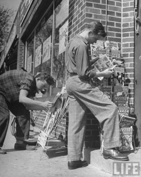
Image

Having little going this weekend, I decided to do some research and find the exact covers for all the comics shown on that rack. We’ll start at the top, and go from left to right.

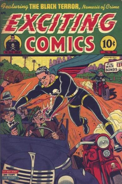
Here’s the first comic, Exciting Comics #38 from April of 1945. Note the sensational cover art by Alex Schomburg. Schomburg was a Puerto Rican-born artist who came to the U.S. in the 1920s and began his ten-year comic-book career in the early 1940s. He worked for Nedor/Better/Standard Publications (as in this instance), and also for Timely Comics, which later evolved into the Marvel Comics Group. Schomburg had two distinct styles; the regular pen-and-ink style, shown here, and a later airbrushed style. For the pen-and-ink covers, he signed his name as Schomburg and for the airbrushed covers, he signed his name as Xela (Alex backwards).

The cover-featured heroes were the Black Terror and his kid sidekick Tim; together, they were referred to as the Terror Twins. Their uniforms or costumes were perhaps the most stylish of those worn by anyone in the Golden Age of Comics. We’ll see them again in this blog entry.
Image

Next on the rack is Captain Marvel Adventures #46, from May of 1945. Probably the best selling comic book of the 1940s, selling over a million copies an issue; CMA was published by Fawcett. Outselling Superman was quite an achievement, and for a while, Captain Marvel Adventures was published every other week instead of monthly, as most comics were.

The head artist for Captain Marvel was C. C. Beck, who later retired to Florida. I was lucky enough to correspond with him by letter in his retirement days and he was an entertainingly cranky and acerbic correspondent! His clean-line art style was perfect for comic books but deceptively simple; his rule, as he wrote to me, was never put in a line that didn’t further the story.

Image

Next on our rack, after a second facing of Captain Marvel Adventures, is Black Terror #10, from May of 1945. The Second World War had ended its European theater by that time, but since comics were written, drawn and printed months in advance, it took a while for them to catch up. In his fight against Nazi villains on this cover, the Black Terror faces a neatly labelled flame thrower; Schomburg was careful to label everything of importance on his covers. He’d have so much going on in his covers that a kid would study them for quite some time after plunking down his dime for the book.

As the comic-book publishers had many stories about WWII in inventory, they’d publish them after with war with Now It Can Be Told! added to the splash pages.

The Black Terror, who in real life was a pharmacist, was invulnerable to knives, flame throwers and bullets, but in almost every story he’d be knocked out by a blow to the back of his head. It confused me as a kid and still does. Maybe it was an Achilles’ heel kind of thing but they should have explained it better in the stories.

Image

Proceeding down the comic book rack, we come to Shadow Comics volume 5, issue 2. Street & Smith published the Shadow, who was later licensed and published by Archie Comics, DC Comics and others after S&S gave up on comics, which was always a sideline to their pulp magazine business. In these original comics, the Shadow was colored a pale blue when he became invisible by clouding the minds of his enemies. Street & Smith comics had a different look than most other comics, with unusual coloring and some painted covers. I suspect that I wasn’t the only kid annoyed by the way they numbered their product with a volume/issue numbering system; it was less straightforward than just the issue numbering. For teenaged boys, who bought most of the comics, having all the issues was a big deal and probably boosted comic book sales. Hillman Publications, who published the wonderful Airboy Comics, also used that volume/issue scheme.

Image

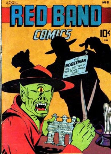
I can’t see enough of the cover of the next comic to identify it, but the one to its right is Red Band Comics, either number 3 or maybe number 4; both had the same cover art and interior contents! I show you the cover of #3 here.

This obscure and rather disturbing and unsatisfying comic was published by an outfit who only operated during 1944 and 1945 called Rural Home Publications. If DC Comics, Fawcett and Dell were first-string publishers, and Nedor/Better/Standard and Timely were second-string, then Street & Smith were third-string and Rural Home was barely in the running.

As you can see, the villain on this cover is quite horrific; the Bogeyman mentioned in the blurb was actually the hero, who’s shadow you see. Bogeyman was a swipe of Will Eisner’s Spirit charactor only drawn with a mustache. Neither Bogeyman or this ugly villain, who’s named Satanas, are in the comic book; covers were to sell the comic and often they promised more than they delivered.
Image

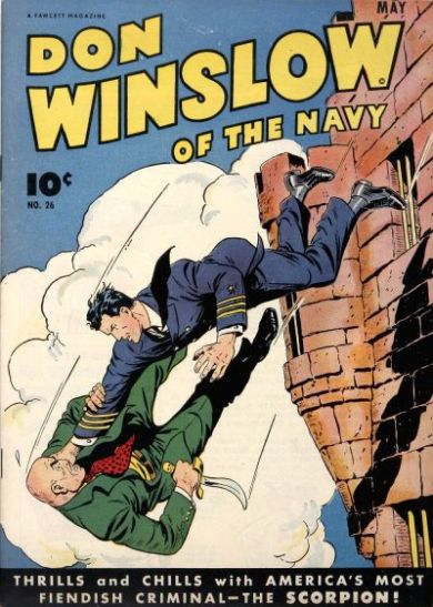
Captain Marvel Adventures #46 gets still another facing on the rack, but to its right is one of my personal favorites: Don Winslow of the Navy! This is issue #26. Don Winslow comics were well drawn and written and after Fawcett got out of the comics business in the early 1950s, they passed the rights to Winslow and a couple of other titles to Charlton Comics, who printed stories that Fawcett had in inventory for a couple of issues.

When I was a kid trying to break into comics in the late 1960s, I’d look for old issues of Don Winslow in second-hand magazine shops in New York City and try to copy the style of the guys who drew them. Great stuff!
Image

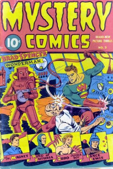
Another obscured issue and then we see Mystery Comics #3, published in 1944 (no month indicated). This great Schomburg cover features Wonder Man battling a mad scientist who’s built a human-sized pink robot who fires a Thompson sub-machine gun and glows, perhaps indicating that he’s radioactive or ultra-electrical or something. Covers sold the comics and what kid could resist a cover like that?!?!?!? This comic gets another facing at the bottom of the rack.
Image

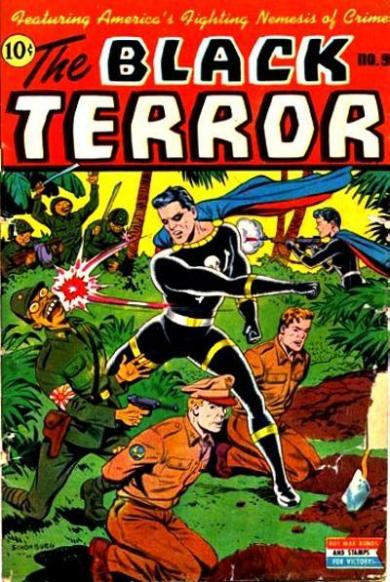
Below this comic on the rack is another issue of Black Terror; this one is #9, from February of 1945. These war-time comics had covers that can make us cringe today; the enemy folks in this Pacific-theater-of-war cover are absurdly rendered to convey their evil qualities, and young Tim doesn’t hesitate to mow them down with another Thompson sub-machine gun, perhaps borrowed from the pink robot in the previous comic. Those Tommy-guns were all over comic book covers in those days.
Image

Our last issue is a whopper; the 194-page Everybody’s Comics from 1944. This giant-sized offering was published by Fox Comics, perhaps the sleaziest of all comic-book publishers (and that’s saying a great deal). What publisher Victor Fox would do was take the comic books returned by news dealers as unsold, bundle three or four random issues together and slap a new cover over whatever the contents were. There are examples of numbered issues of these giant comics that have totally different interiors; it was all very slapdash and shoddy.

Image

That’s all for this entry. As I mentioned in the previous entry, there are no DC Comics (or Dells, or Timelys, or MLJ/Archies) on this rack, which leads me to suspect there were other comic-book racks at this store not shown in the photo.

UPDATE:  I can’t resist showing you one of Alex Schomburg’s airbrush-style covers; this one is from Exciting Comics #66. Much different than the ornately detailed covers he did using his pen-and-ink style, wouldn’t you say?
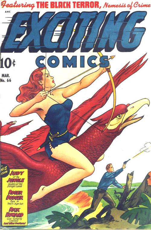
Exciting_066_JVJ.cbz - Page 1

DC Comics History: Get This Book!

2 Comments

Image

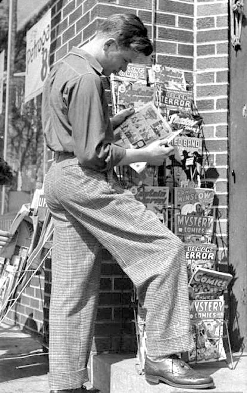
A precursor of The Office’s Jim Halpert looks at comics on sale. Oddly enough, not one DC comic on this rack. Based on the cover of Don Winslow of the Navy #26 and Red Band Comics #4 or 5 (both used the same art!), this was taken in March of 1945.

As a kid, I would read any comic book I could get my hands on, but my favorites were DC Comics. The writing, characters and production values were, to me, the best of anything out there. I liked other brands, like Harvey, Archies and Dell, but DC was tops.

Marvel Comics, at that time, was not making superhero comics; their offerings were mainly books about monsters or takeoffs on comics produced by other companies. If Harvey Comics put out Casper, the Friendly Ghost, Marvel would put out Homer, the Happy Ghost, and Charlton Comics, the bottom of the barrel in production values, put out Timmy, the Timid Ghost. One day, I’ll do a blog entry on the laughable print quality of Charlton Comics; they were usually printed so far out of register that they looked like the old red-blue 3-D comics.

So it was mainly DC for me!

My primary fascination was the drawing, but I was also intrigued by the production aspects of the things:

• How did they get from typewriter and pencil to the finished book?

• How did they print the 64 colors used?

• How come some comics used line screens for colors and some used dot screens?

• How did they get the logos and such so perfect on each issue?

• Who owned the company (DC at that time was called National Periodical Publications, Inc)?

• How did all the drugstores and newsstands get these books on the racks every other Tuesday morning?

• How much did the ads in the books cost and did they bring in dimes from the readers?

• How many copies of each comic did they print?

• How come some comics were monthlies and some were bi-monthlies?

• Why was the cost a dime?

What kind of company makes comic books?!?!??

Image

When I was a kid, drugs stores were the best place to buy comics, as they seemed to carry all the issues published. Based on the cover of Action Comics #243 in this photo, it was taken in May of 1958. Yes; I am a geek! Had this photo been taken in Pascagoula, Mississippi, that could have been me in the pale jacket reading Strange Tales #65.

That was the stuff I wondered about.

I needed the following book: 75 Years Of DC Comics: The Art Of Modern Mythmaking, written by Paul Levitz, former president and publisher of DC Comics.

Image

Nice touch: The title lettering mimics the lettering used on DC’s Action and Adventure comic book titles.

720 pages in a large, 15-1/2″ x 11-1/2″ format, weighing in at about 15 pounds, this is a stunner of a book. Absolutely engrossing, written in an amusing yet authoritative style, it’s simply the best history of comic books out there, and I’ve read ’em all. It’s expensive at over $150, but if that’s what it costs, so be it. It’s well worth more than that.

The book, heavily illustrated with comic covers and interior pages as you might expect, is augmented by rare photos of DC folks, from founders Malcolm Wheeler-Nicholson, Harry Donenfeld and Jack Liebowitz to production folks like Sol Harrison, Jack Adler, and, of course, many of the art and writing talents from DC’s history. Associated media, like cartoons, TV shows and films are well covered, too.

For me, whose interest in primarily in the marketing and print-production aspects of the comic books, a fascinating discovery was the cover/sales chart sheets kept by Irwin Donenfeld, Irwin was the son of DC co-founder Harry Donenfeld, and was co-owner, editorial director and vice-president of DC from about 1948 to 1968. These hand-drawn charts showed the covers of each DC comic by month, with notations of the size of the print run and percentage of copies sold written under each cover.

Image

Notice the Batman logo change on this series of covers from the mid-1960s; one of Irwin Donenfeld’s sales charts.

Brilliant.

75 Years of DC Comics: Buy it, borrow it or check it out from a library; it is an amazing piece of work! You will learn something new on every page and the visual appeal is breathtaking. Here’s the Barnes & Noble info:

http://www.barnesandnoble.com/listing/2684868360209?r=1&cm_mmca2=pla&cm_mmc=GooglePLA-_-Book_45Up-_-Q000000633-_-2684868360209

Non-English Onomatopoeia in the Comics

2 Comments

Not being able to read any language but English, I don’t really collect foreign (to me)-language comics. But I enjoy looking at the vintage ones. These differ from what we’re used to in the United States; the covers are usually color, but the interiors are often black-and-white, and the page counts and formats are all over the place.

Sometimes the art is crude, but more often than not you find splendidly drawn issues. Even more so than in this country, foreign comic books seem to be printed on the cheap, but some of the art– especially in the comics from Spain– is miles above what we saw in this country during the same era. Someone could probably make a mint by translating and reprinting some of these comics, which are legally in the public domain. Who could resist the adventures of Jim Turbine (Italian, I believe) or Mendoza Colt (Spain)?

Check out these great covers:

Aventuras Del FBI 004

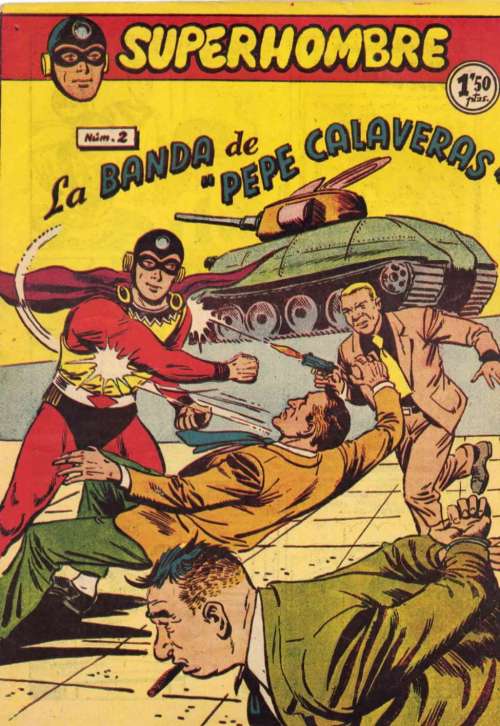
Somewhat surprising to see a book from Spain about the adventures of the U.S. FBI, but it looks exciting!

El Libertador 030

El Duende 033

Xuxa 022 (1953)

Somehow this looks like a package design rather than a comic book cover; perhaps a package for those little nasal-hair trimmers.

Superhombre 002

Plutos 003

Plutos may look a bit fey here, but in the B&W interiors, he’s like a kickass Batman with pistols and a mustache!

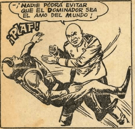
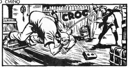
One thing I enjoy about these comics are the written sound effects, which can come as a total surprise! On the whole, foreign-language comics tend to have fewer of these sound effects than North American comics do, but when they do, they are great fun. Here are some wonderful examples:

Screen Shot 2013-08-04 at 2.03.56 PM

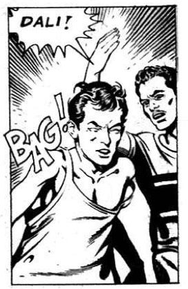
Nicely lettered sound effect, but sounds odd to an English-speaker!

Screen Shot 2013-08-04 at 2.04.14 PM

Here’s BAG again, and some others!

Screen Shot 2013-08-04 at 1.44.40 PM

I tried to pronounce this one but gave up.

Screen Shot 2013-08-04 at 1.44.23 PM

Nothing wrong with this one!

Screen Shot 2013-08-04 at 1.44.09 PM

The more I mentally pronounce this effect, the more I like it.

Screen Shot 2013-08-04 at 1.42.18 PM

Here’s another sound effect that works for me.

Screen Shot 2013-08-04 at 1.42.07 PM

Here’s a riot of sound effects from Superhombre!

Screen Shot 2013-08-04 at 1.32.01 PM

My personal favorite; it’s as good as it gets as a sound effect.

Screen Shot 2013-08-04 at 1.31.44 PM

This would have been better if the object thrown was an ugly plastic shoe . . .

Screen Shot 2013-08-04 at 1.31.25 PM

This effect reminds me of the nickname of the old Plastic Man character.

Screen Shot 2013-08-04 at 1.22.53 PM

Don’t quite get this one.

Screen Shot 2013-08-04 at 1.22.35 PM

Far better than BOOM, to my way of thinking.

Screen Shot 2013-08-04 at 1.21.56 PM

Okay; they could have done better on this one.

Remember earlier when I wrote that the quality of the art in some of these books was brilliant? Check out this interior page from Mundo Futuro 026, a comic book published in Spain in the 1950s. Of course, it begs for a sound effect; an atomic explosion without a BUUUUM?!?!?!?

Mundo Futuro 026Click on this page to enlarge the art; it’s really remarkable.

If you’d like to investigate these comics for free, just visit www.http://comicbookplus.com. They have scads of them!