Home

Non-English Onomatopoeia in the Comics

2 Comments

Not being able to read any language but English, I don’t really collect foreign (to me)-language comics. But I enjoy looking at the vintage ones. These differ from what we’re used to in the United States; the covers are usually color, but the interiors are often black-and-white, and the page counts and formats are all over the place.

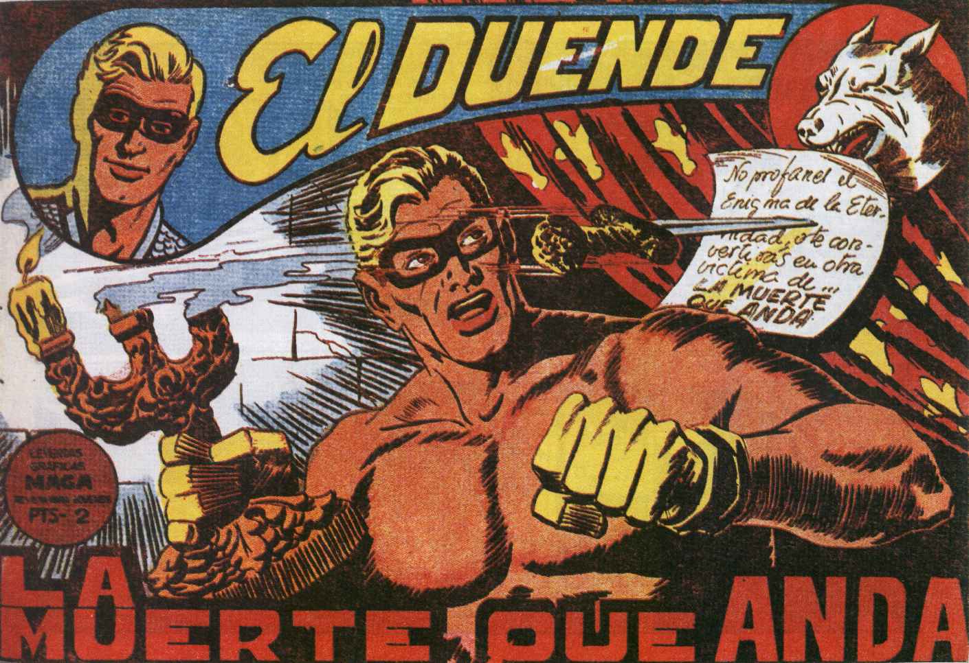
Sometimes the art is crude, but more often than not you find splendidly drawn issues. Even more so than in this country, foreign comic books seem to be printed on the cheap, but some of the art– especially in the comics from Spain– is miles above what we saw in this country during the same era. Someone could probably make a mint by translating and reprinting some of these comics, which are legally in the public domain. Who could resist the adventures of Jim Turbine (Italian, I believe) or Mendoza Colt (Spain)?

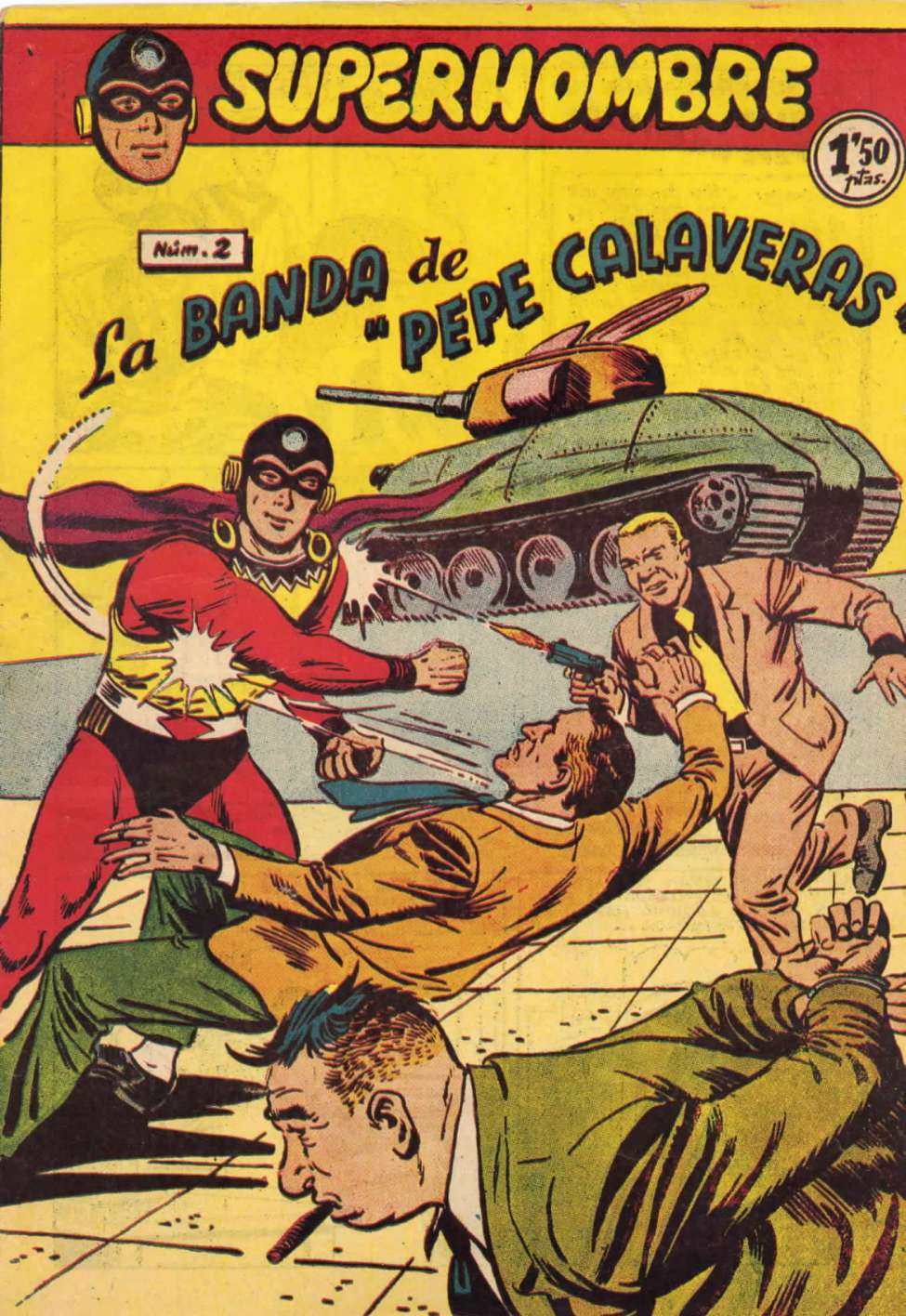
Check out these great covers:

Aventuras Del FBI 004

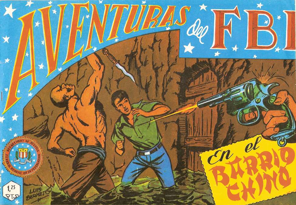
Somewhat surprising to see a book from Spain about the adventures of the U.S. FBI, but it looks exciting!

El Libertador 030

El Duende 033

Xuxa 022 (1953)

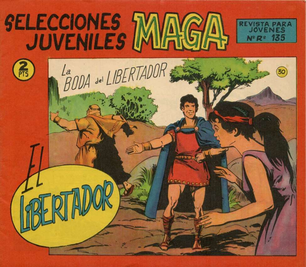
Somehow this looks like a package design rather than a comic book cover; perhaps a package for those little nasal-hair trimmers.

Superhombre 002

Plutos 003

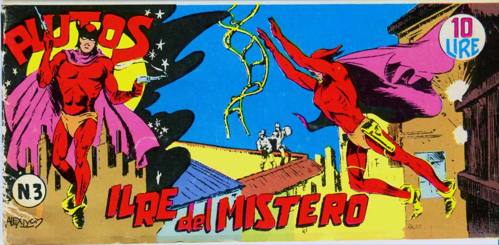
Plutos may look a bit fey here, but in the B&W interiors, he’s like a kickass Batman with pistols and a mustache!

One thing I enjoy about these comics are the written sound effects, which can come as a total surprise! On the whole, foreign-language comics tend to have fewer of these sound effects than North American comics do, but when they do, they are great fun. Here are some wonderful examples:

Screen Shot 2013-08-04 at 2.03.56 PM

Nicely lettered sound effect, but sounds odd to an English-speaker!

Screen Shot 2013-08-04 at 2.04.14 PM

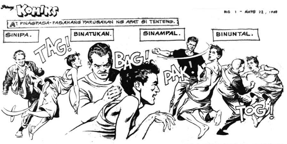
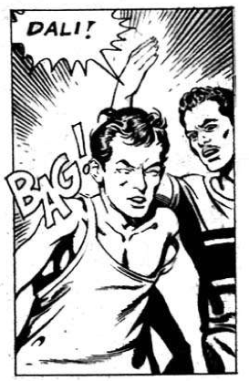
Here’s BAG again, and some others!

Screen Shot 2013-08-04 at 1.44.40 PM

I tried to pronounce this one but gave up.

Screen Shot 2013-08-04 at 1.44.23 PM

Nothing wrong with this one!

Screen Shot 2013-08-04 at 1.44.09 PM

The more I mentally pronounce this effect, the more I like it.

Screen Shot 2013-08-04 at 1.42.18 PM

Here’s another sound effect that works for me.

Screen Shot 2013-08-04 at 1.42.07 PM

Here’s a riot of sound effects from Superhombre!

Screen Shot 2013-08-04 at 1.32.01 PM

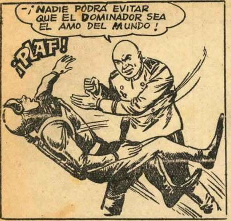
My personal favorite; it’s as good as it gets as a sound effect.

Screen Shot 2013-08-04 at 1.31.44 PM

This would have been better if the object thrown was an ugly plastic shoe . . .

Screen Shot 2013-08-04 at 1.31.25 PM

This effect reminds me of the nickname of the old Plastic Man character.

Screen Shot 2013-08-04 at 1.22.53 PM

Don’t quite get this one.

Screen Shot 2013-08-04 at 1.22.35 PM

Far better than BOOM, to my way of thinking.

Screen Shot 2013-08-04 at 1.21.56 PM

Okay; they could have done better on this one.

Remember earlier when I wrote that the quality of the art in some of these books was brilliant? Check out this interior page from Mundo Futuro 026, a comic book published in Spain in the 1950s. Of course, it begs for a sound effect; an atomic explosion without a BUUUUM?!?!?!?

Mundo Futuro 026Click on this page to enlarge the art; it’s really remarkable.

If you’d like to investigate these comics for free, just visit www.http://comicbookplus.com. They have scads of them!

Murphy Inspects . . .

1 Comment

Tremolux & Barris Custom, Murphy

Murphy inspects my 1966 Fender Tremolux amp in its custom JD Newell cabinet with two Weber 12A125A speakers; the amp has been at Don Oliver’s studio for a couple of years and returned last evening.

Murphy hasn’t seen this amp before!

The Tremolux is not a Fender amp that’s often seen; they were only made for a couple of years. I had wanted one since I first saw the cover of the Blind Faith album; Clapton is shown here with that amp at the Rolling Stones December, 1968, Rock and Roll Circus event as a member of the one-shot Dirty Mac Band, consisting of Clapton, John Lennon, Keith RIchards on bass, and Mitch Mitchell on drums.

Clapton's Tremolux

I believe Clapton endorses a new Tremolux combo amp made by Fender nowadays, but I’m sure it isn’t much like the original ones. For one thing, they cost over two grand.

I have the original piggyback head cabinet for my Tremolux, restored by Rocco Egizio of Rockometer Amp Cabinets in Chicago, but I don’t have a proper speaker cabinet for that configuration, so it lives as a combo. One day I’ll find a speaker cabinet, but it has to be a 4-ohm one for the Tremolux.

The guitar is my Hallmark Barris Kustom, which sounds nice through the Tremolux. For you gearheads out there, the Barris Kustom has a single pickup with just a volume control; the pickup is Bob Shade’s recreation of the old Carvin AP-6 classic.

Murphy and His Toys

5 Comments

Our Boston terrier, Murphy, is quite a character, as all who know him will agree.

He is curious about many things. Shown here last year, he wonders about my grand-daughter Maddie’s toy laptop.

Murphy And Maddie

Murphy has strange beliefs. To you and me, who see with our eyes, this is an ordinary vacuum cleaner. To Murphy, who sees with his nose, this is a dog trapped in a cloth bag attached to a machine. Every evening, Murphy comes to me barking, and won’t stop until I’ve walked to the vacuum cleaner on the back porch and patted it and told him that all is well; there’s no dog inside the machine. He believes me for the next 24 hours, but then doubt sets in, and we go through the procedure another time. Every day!

Vacuum Or Dog?

Here’s Murphy in my bedroom with all his toys. He used to keep them in a group on the living-room couch, but he slowly began transferring them to my bedroom, one by one. He’ll take a toy downstairs to play with for a while, but he always brings it back to the bedroom upstairs when he’s done playing.

Murphy's Toys

I’ve numbered the toys so that you can easily identify them as you look at the photo. 1) A hard red rubber ball (Bostons are strong and determined chewers, so their toys must be durable). 2) Another hard red rubber ball. Murphy can tell them apart, but we can’t. 3) A JCrew tie I decided was too ugly to wear. Murphy has gone through four ties in the last year. This one is ready for the trash. 4) A tug-of-war rope. 5) A blue-and-white hard-plastic bone, also ready for replacement. 6) A ridged hard-plastic bone. 7) A red-and-beige hard-plastic bone. 8) A hard-plastic S-shaped object. 9) A hard-plastic propeller.

His favorite toy, not shown because it was in my bed when I took the photo, is a black Kong Extreme dog toy, shown here.

Black Kong Toy

Murphy thinks I love this toy as much as he does, and he wakes me in the morning by pushing it into my hand as I sleep. That means he’s decided it’s time to wake up and play!

Fountain Pens Are Good For You!

4 Comments

Sheafcartf

Sheaffer Student Pen Value Pack; Note The Translucent Blue Barrel.

Growing up in the 1950s and ’60s, I was a fountain pen user. I can remember the very first ballpoint pens I ever saw, when I was in the first grade (1958 or so) living in Pascagoula, Mississippi. The drug store nearest our school was giving away cheap plastic ballpoint pens from a box that was big enough to hold thousands. Like my classmates, I scurried in, grabbed a handful, and ran to school. I remember snagging six pens that day, and not one of them worked.

Giveaway Ballpoints

Giveaway Ballpoints; My Grandmother Loved Using These!!!

Later, when I saw the Bic ballpoint pens, I was much more favorably impressed. Those pens were cheap, non-refillable throwaways, but they worked perfectly and were good value. I seem to recall that they cost 19¢. If you took the blue plug out of the back end and sucked on the tube barrel, you’d get a mouthful of blue ink; I learned that the hard way.

The Original Bic Pen

The Original Bic Pen

I much preferred my fountain pens, as I was a constant doodler, and fountain pens were better– for me– to draw with. The fountain pens I used back then, and all through high school, were the cheap Sheaffer fountain pens you could get for a buck or so. They used ink cartridges and worked fine. I liked the medium-point nibs on mine.

Sheaffer Student Pen

My favorite Sheaffers had the translucent candy-colored barrels, shown here:

Sheaffer Trans Pen

Sheaffer-Green

A few ballpoints crossed my path. I tried a Parker ballpoint, shown here. I still have it.

Parker Ballpoint

I liked it fine for a ballpoint but went back to my cheap fountain pens. Like every kid in America, I received a Cross ballpoint pen and mechanical pencil set for my high-school graduation. Hated ’em. The pen wrote in a scratchy fashion and the pencil was crap.

Cross Pen Set

Cross Pens Made Me Cross!

For art, I used dip pens with Speedball and Hunt nibs using Higgins India Ink from a bottle, or Rapidographs or Leroy technical, which used cartridges and had nibs in a variety of point sizes. Those pens using India Ink had to be cleaned the second you were done with them or the dried ink was extremely difficult to clean off. I still have a fishing tackle box from college days filled with these dip pens and nibs.

It's Easy To Do This With A Speedball Pen; yeah, right!

It’s Easy To Do This With A Speedball Pen; yeah, right!

When all is said and done, I still prefer fountain pens. My current favorite is a Parker silver-crosshatched Sonnet with a medium nib, which looks a lot like my old Parker 75, but there are several brands in my mahogany pen box and part of the fun of fountain pens is using different pens and inks depending on the mood you’re in on a given day!

Here’s what my Parker looks like:

Parker Cisele Sonnet Fountain Pen

Parker Cisele Sonnet Fountain Pen

Parker calls this silver crosshatch style “cisele,” which is a French term for having a chiselled appearance. Kenneth Parker, president of Parker Pens back in the early 1960s, had a cigarette case with this silver grid pattern, liked it, and decided it would be perfect for the Parker 75 they introduced in 1963. It is a snazzy-looking finish!

Sheaffer Cartridge Pen Ad, 1957

Sheaffer Cartridge Pen Ad, 1957

Look! Up In the Sky!!!

Leave a comment

Look!  Up in the sky! It’s a bird! It’s a plane! It’s Superman!

Yes, it’s Superman!  Strange visitor from another planet who came to Earth with powers and abilities far beyond those of mortal men.  Superman, who can change the course of mighty rivers, bend steel in his bare hands!  And who, disguised as Clark Kent, mild-mannered reporter for a great metropolitan newspaper, fights a never-ending battle for truth, justice, and the American way!

TAOS Title

That insistent intro to the mid-20th Century version of the Man of Steel came from the pen of Olga Druce, who wrote for the Superman series on the radio, before television was available to the average American. They had several variants of that intro on the radio show, and added the portion about the American way when the United States entered the Second World War.

American Way

To my generation, George Reeves, who played Superman and Clark Kent on the Adventures of Superman TV show from 1952 to 1958, was the real deal. He not only looked like Superman should look, but he was a wonderful Clark Kent. His version of Kent was better than what we’ve seen since, since his Clark Kent was really the focus of the show. He wasn’t particularly mild-mannered, as portrayed by Reeves, and he seemed like a genuinely good guy to have around. Superman was the guy who came on to wrap things up.

Clark Kent George Reeves

There are a lot of websites that provide an astonishing amount of info regarding this show, and I urge you to Google around and find them. The main purpose of my little blog entry today is to get one point across that has troubled me about the recent film and television versions of Superman: He’s portrayed by actors who are too young, in my opinion. They are excellent, but more Superboy than Superman.

Stern Superman

Reeves was 38 when the Adventures of Superman began airing in 1952 and he was 44 when the show ended; he died the next year, either by suicide or murder, depending on whom you’re listening to. He was a bit player in the movies prior to the Superman show; he was in Gone With the Wind and some more forgettable movies. Prematurely gray, his hair had to be sprayed black for the show. The legend is that a DC Comics executive spotted Reeves on the beach in California when they were casting for the show. The executive, Whitney Ellsworth, thought the muscular fellow looked like the comic-book Superman, and was convinced he was the one they were looking for when Reeves put on his sunglasses; he then looked like a great Clark Kent! I suspect that today, George Clooney could nail the part.

George Playing His Guitar

Reeves was disappointed at first in his role as Superman; he remarked to the actress playing Lois Lane that they had reached the bottom of the barrel in their acting profession. But he was by nature a cheerful person, and embraced the idea of being a hero to American kids. The first season had a hard-assed version of Superman; he’d tell crooks he’d break every bone in their body if they didn’t cooperate and he killed a few people, or at least put them in situations that led to their deaths. Since this was very early TV, the special effects were primitive and low-budget; they used stock footage over and over. None of us kids probably noticed that when Superman was shown flying from left to right, his “S” emblem was backwards because they just flipped the film. I notice it now but it’s kind of cheesy-cool.

Reeves On Set

When the Kellogg’s cereal company signed on to sponser the show to promote their line of kid cereals, they insisted the producers tone down the angriness and violence. George Reeves became a kinder and gentler Superman, and the show was a hit. It has never been off the air since; the 104 episodes are available on DVD. The first two seasons were filmed in black-and-white, and the last four were filmed in color, though originally broadcast in B&W; no one had color TV at that time! If you watch the shows, and you may believe me when I say you’ll greatly enjoy them, pay particular attention to Jack Larson, who played Superman’s pal, Jimmy Olsen, and Noel Neill, who was Lois Lane from the second season on. They add so much to the show, in their earnest portrayals, and both are still alive and going strong today!

Clark, be careful; Jimmy's right behind you!

Clark, be careful; Jimmy’s right behind you!

Kirk Alyn as Superman

Kirk Alyn as Superman

There had been an earlier film Superman, who made two serials or chapter-play Superman movies. The actor playing Superman/Kent was Kirk Alyn, who was a slender and graceful former ballet dancer. He looked great, but wasn’t particularly powerful in the roles. Reeves, a former boxer with the broken nose to prove it, was convincing as a brawler and made a more convincing Man of Steel. He looked good in his simple woolen costume, even though they had to pad his shoulders a bit, and though some folks today think he’s a tad pudgy, he was exactly what the kids of the early ’50s expected in their Man of Steel. I can vividly recall hearing, when I was in the second grade, that Reeves had died. None of us kids could believe it.

George Reeves At Home

There will never be a better Superman than George Reeves.

George Reeves Color

When Is a Pie Not a Pie?

Leave a comment

When it’s a cake! Patty created this masterpiece from a Martha Stewart recipe she found online. It is a strawberry cake, believe it or not.

As you can see, it looks like a pie and has not yet been tasted. It smells great!

Strawberry Cake

Of course, this cake reminds me of something musical: Lisa Loeb’s wonderful 2002 Cake and Pie album, which included great work by her friend, Dweezil Zappa. My favorite track is We Could Still Belong Together, but the entire album is certainly worth your time.

Lisa Loeb- Cake And Pie Cover

For those who’ve chided me about not posting recently, I can only plead for your forgiveness because I’ve been out of town for two weekends and busy at my daily contract assignment. I have a few posts started, but gathering the images and getting the text worthy of someone’s time reading it isn’t something I can do at lightening speed.

Here’s the Martha Stewart recipe for those who may be interested:

http://www.marthastewart.com/336020/strawberry-cake

Enjoy!!!

UPDATE: Having demolished a slab of this strawberry cake– it never knew what hit it– I can assure you it is a keeper recipe. Trust me. As my old boss Norbert used to say, “You will very enjoy.”

‘NOTHER UPDATE: Originally, I had featured a YouTube video of the Lisa Loeb song referred to above with visuals from Pride and Prejudice; sorry, but that YouTube video is gone. Here’s the song with visuals from a movie series you may be familiar with:

Today’s Mission: Save This Planet!

2 Comments

Image

Don’t worry; today’s entry has nothing to do with Al Gore. It’s all about something much more compelling, realistic and important: Comic-book covers!

Image

Mystery in Space, a DC-published comic that ran for 110 issues from 1951 to 1966, was one of my favorites. Edited by the amazing Julius Schwartz, it featured art by some of my favorite artists: Carmine Infantino, Gil Kane, and Murphy Anderson.

Image

When I tippytoed into the world of professional comic-book production for a couple of summers while in high school, the first thing I learned was that the covers sold the books. It was no accident that the covers of comic books were printed on glossy coated stock using high-resolution screens while the interiors were tossed off on newsprint with coarse screens and muted color reproduction. The art on the covers was almost always much better than what was found in the interiors of the book. So what? It was a stricture of the art form, and covers were what sold the books.

Image

One of the leitmotivs of DC-comics covers, along with purple gorillas, Jimmy Olsen turning into something weird and Lois Lane in trouble, was perils to Earth. In the Mystery in Space books, editor Schwartz took this to a high level in the early days of the series. For pre- and early-teen American boys, this had resonance: we were just beginning the American space program, and who knew whether this might set off some trip-wire arranged long ago by aliens? It was worth staying up at night to worry about!!! Also, and even more unsettling, these covers indicated that it was the Northern hemisphere that these evil aliens were focusing on. They could care less about Europe, Asia, Africa; their eyes were on the U.S.A!!!

Image

Were aliens watching our every move? Probably! Were they thinking “Hmm; the primitive Earthlings have now reached the stage where they have both atomic weapons and the ability to rocket into space. We’d better smush them like bugs before they prove troublesome to us!!!”? What a burner for our species, huh?

Image

So we kids would look for, buy, read and re-read these comics. So what if this clarion cry came from a funny book? The guys who wrote and drew them were obviously smart; look at all the scientific facts crammed into these stories!

Image

Here are, for your enjoyment and amusement and so you can prepare for our destruction, some of the great Mystery in Space covers showing Earth in peril.

BE WARNED! THE ALIENS ARE OUT THERE AND THEY’RE WATCHING US!!!

Image

Image

Image

Image

Image

Image

Image

Yours Truly, Old-Time Radio!

7 Comments

Family Radio

For those who have grown up listening to radio as it is today, what we fans call “old-time radio” (OTR) is a revelation. Radio before 1962 had many great series shows, and they included comedy, drama, horror, soap opera, detective and other offerings. Many, like Dragnet and Gunsmoke, later became television programs as TV became available in the early 1950s. I know of one series (Have Gun, Will Travel) that was a television show first and then became a radio show.

If you have a long commute to work, there is no better way to pass the time than listening to OTR and it needn’t cost you a dime.

While in Scranton, Pennsylvania, a couple of times recently, I was lucky enough to visit the radio studio in the Scranton Times Tribune newspaper building, which still looks like it did when it was used in the 1930s. Here’s a great photo showing a radio studio in the 1940s:

Radio Studio 1930s

If you have XM or Sirius satellite radio, discovering OTR is easy. Just tune to channel 82 and listen to the offerings hosted by OTR wizard Greg Bell (his website is gregbellmedia.com). Greg provides interesting commentary and the shows on his Radio Classics channel have superb-quality audio. His content provider, RadioSpirits.com, also sells classic radio shows on disc. Many folks I know say Greg’s channel is the main reason they subscribe to satellite radio, and my wife and I agree!

If you want to download OTR, there are many sites, both free and subscription; just Google Old TIme Radio and download the files. Please know that the audio quality on many of these, uploaded by OTR fans and collectors, aren’t what you’ll hear on Radio Classics.

Now that we’ve got that stuff out of the way, let’s look at one of the best of the OTR series: Yours Truly, Johnny Dollar. This detective show lasted a long time; there were over 800 episodes from 1949 to 1962. Johnny Dollar was “the man with the action-packed expense account,” and the premise of the show was that Johnny Dollar was describing the incident while compiling his expense account to whatever insurance company had hired him that week. Johnny’s file on each case was usually referenced as a “matter,” as in “The Silver Blue Matter” or “The Forbes Matter.”

Johnny Dollar was the last of the episodic OTR shows, and over the years there were several actors who played the hard-boiled insurance investigator. My favorite was Bob Bailey, who had a world-weary and somewhat sarcastic delivery perfect for the part:

Yours truly, Bob Bailey

Yours truly, Bob Bailey

Here are a couple of Johnny Dollar episodes for your enjoyment. The first stars Mandel Kramer as Johnny Dollar, and is a half-hour complete episode from the last couple of years of the show:

The Medium Rare Matter

Now, for comparison, here’s my favorite: Bob Bailey in an earlier version of the same show. This episode is part four of the five-part version of the show that ran for a while:

Part Four: The Medium Well-Done Matter

Those of you who remember the Firesign Theatre’s Nick Danger, Third Eye spoof of old-time radio will recognize a lot of Johnny Dollar in Nick!

A huge part of the attraction of these shows were the sounds effects, created by talented and inventive folks called foley artists, and here’s a YouTube video showing how these effects were created. It’s a hoot!

I’ll be discussing other great OTR shows in the days and weeks to come; be sure to TUNE IN!

My First Published Work!

1 Comment

Sherman, please set the WABAC machine to 1962 and let’s look in on ten-year-old Jimbo Page, who’s family is spending that summer in Apalachicola, Florida.

His dad, who is a stern and unfriendly person, loves airplanes and little Jimbo decides that since his dad’s favorite magazine, Trade-A-Plane, publishes a little one-panel cartoon in the upper-right corner of every cover, he’ll draw something and submit it for their consideration and– maybe– they’ll publish it. They did!

As a fourth-grader, I was amazed to see something I drew in print in a national– if decidedly niche– publication!!! Trade-A-Plane is still being published, though I’m not certain if they still are a tabloid pub printed on canary-yellow newsprint, and I’m not certain they’re still published in Crossville, Tennessee.

My dad seemed astonished when the magazine came in the mail and my cartoon was on the cover. He soon got over that, I suppose.

A very gracious person at Trade-A-Plane was nice enough to find and scan my cartoon and send it to me this afternoon (thanks, Linda!!!). She’s even sending me a collection they published a few years ago of their best cartoons, and mine was one of the ones in the collection.

As I look at this effort now, I see stuff I didn’t see when I drew it. Being a kid, I didn’t realize that printers needed an inked, not pencilled, piece for printing (notice the signature of the person who kindly inked it at the publication for me in the bottom right of the cartoon). Also, I misspelled “Apalachicola.” The two people are drawn (from a World Book photo of Wright and a comic-book drawing as references) in two different styles. The microphone and reporter’s hand are awful. Most absurd is that I accidentally drew Wilbur instead of Orville Wright, which messes up the gag; Orville sported a mustache.

I guess I was just too excited and eager to mail it in to care about niceties, and I was just a ten-year-old kid.

As Conan Doyle once said, when someone pointed out a few mistakes in one of his best-loved Sherlock Holmes stories, “Sometimes one has to be masterful regarding details.”

Anyway, here’s the cartoon:

JamesPageCartoon

Older Entries Newer Entries